

Secondary Logo
Home > Visual Identity > Logos > Secondary Logo

University divisions, colleges, and some donor-named centers may request and use a secondary logo.
As with all Grand Valley logos, creating your own logo is strictly prohibited.
Jump to: Setups | Color | Minimum Size | Clear Space | Contrast | Common Mistakes | Logo Package Request
Setups
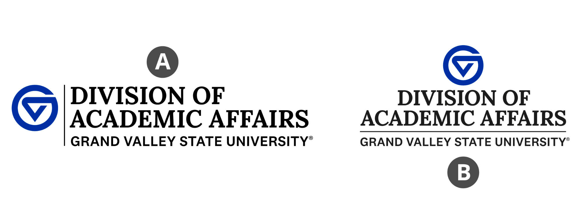
A secondary logo is comprised of the logomark adjacent to a uniquely created logotype. The logotype includes the unit's name and "Grand Valley State University" below it.
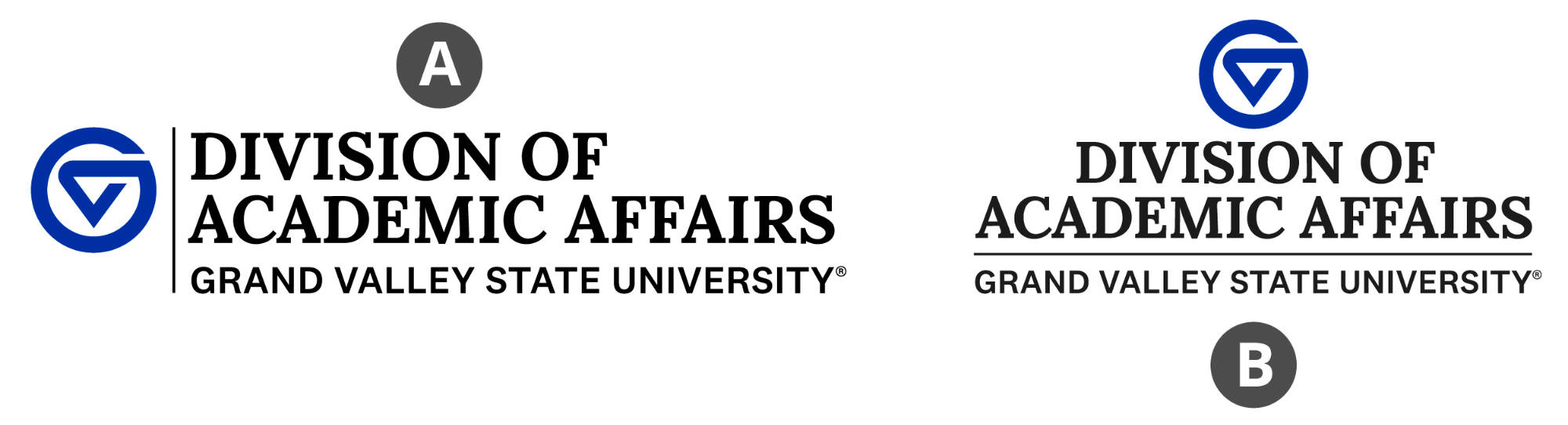
(A) Division of Academic Affairs markleft
(B) Division of Academic Affairs marktop
When the logomark is set to the left of the logotype, we refer to the logo as being "markleft". When the logomark is set above the logotype, we refer to the logo as being "marktop".
Minimum Size
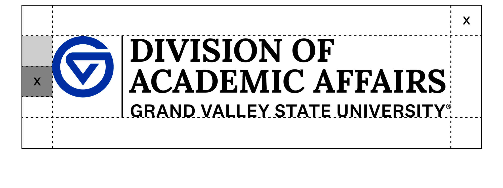
Minimum height guidelines ensure that the secondary logo is legible in all printed and digital media. The minimum size requirements are based on the height of the logomark within the secondary logo.
The logomark must be at least 0.25 inches tall on printed items, or at least 18 pixels tall on digital items.
Specialty production methods like screen printing and embroidery may require larger output than the sizes mentioned here, depending on vendor capabilities and equipment. Always defer to vendor recommendations.
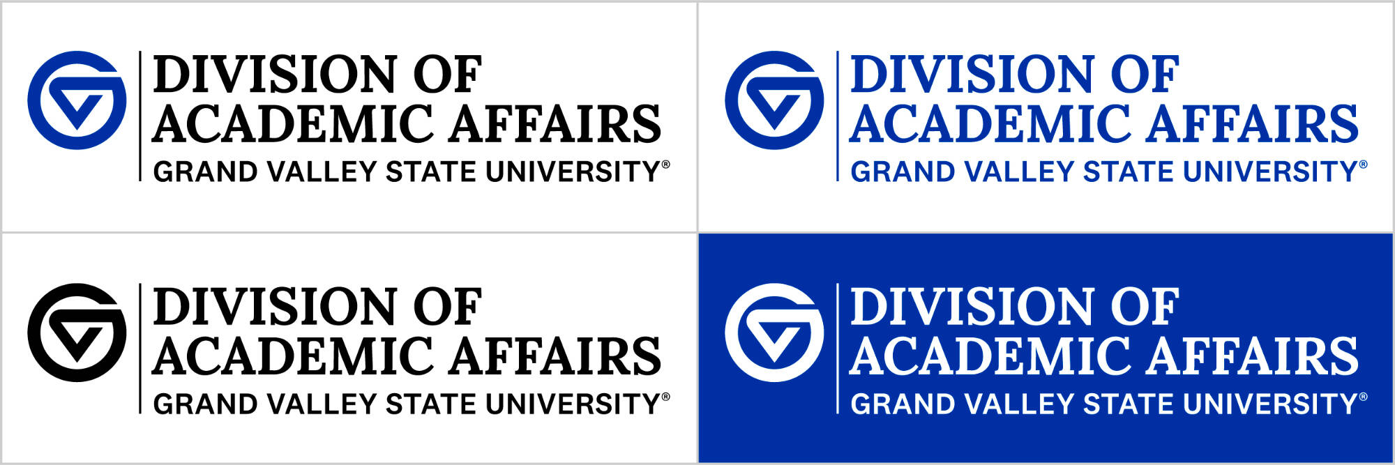
Contrast
Use the version that provides the strongest contrast against its background.
Special care should be taken when using a secondary logo over a photo or patterned background. Avoid photos that make the secondary logo difficult to read. Choose a secondary logo in the color that will stand out best against the photo's colors.
Tip: Add an overlay or gradient over the background to increase contrast between the logo and the background.

- Do not stretch, distort, or rotate the secondary logo.
- Do not obscure, delete, or alter any aspect of the complete secondary logo.
- Do not use the logotype without the logomark accompanying it.
- Do not change the secondary logo's color.
- Do not add other artwork to the secondary logo.
- Do not combine the secondary logo with other logos, designs, or marks.
- Do not use the secondary logo on a background that provides insufficient contrast.
- Do not place the secondary logo where a hole-punch or binding may interfere with it.
- Do not reverse the secondary logo out to a color other than white.
- Do not attempt to replicate the secondary logo in a different font.
- Do not add any graphic effects to the secondary logo, such as outlines, gradients, or drop shadows.
Logo Package Request
If you represent a of Grand Valley division, college, center, school, office, or department, it is likely that a logo already exists for your specific unit. Please check with your administrative person or department head to ask if they already have the files. If they do not, you may request an official logo package by completing and submitting our Logo Package Request form. If approved, you will receive a OneDrive link to the logo package within approximately 2 weeks. Note: requires a valid GVSU network login to access.