Color
Home > Visual Identity > Color
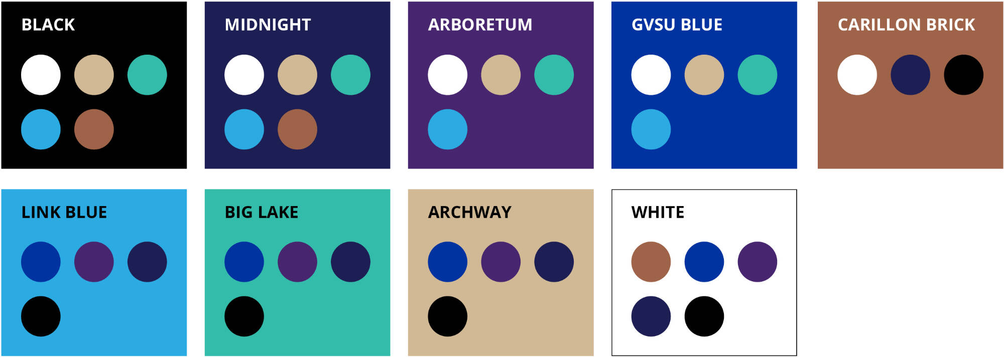
Color Palettes
Primary Palette
GVSU Blue, black, and white are Grand Valley’s official colors. They are rooted in our history and identity as an institution.
While all three are appropriate to use when representing Grand Valley, GVSU Blue should always be included in your design (with the exception of black and white printing) and should be the dominant color on all communication pieces.
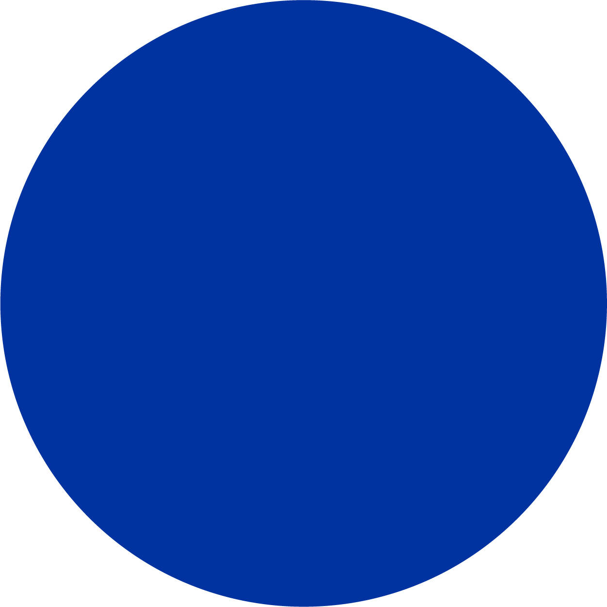


PMS 286
CMYK 100/75/0/0
RGB 0/50/160
Hex #0032A0
CMYK 0/0/0/100
RGB 0/0/0
Hex #000000
CMYK 0/0/0/0
RGB 255/255/255
Hex #FFFFFF
Secondary Palette
Our approved secondary colors are inspired by our campuses and are colors that complement and enhance GVSU Blue. By using them in your communications, you will leverage existing branding and achieve a more professional and cohesive look.
The secondary color palette should be used sparingly to accent the primary palette. GVSU Blue is the main color of the university and should be present in your designs.

Link Blue
Process Cyan
CMYK 100/0/0/0
RGB 14/203/240
Hex #0ECBF0
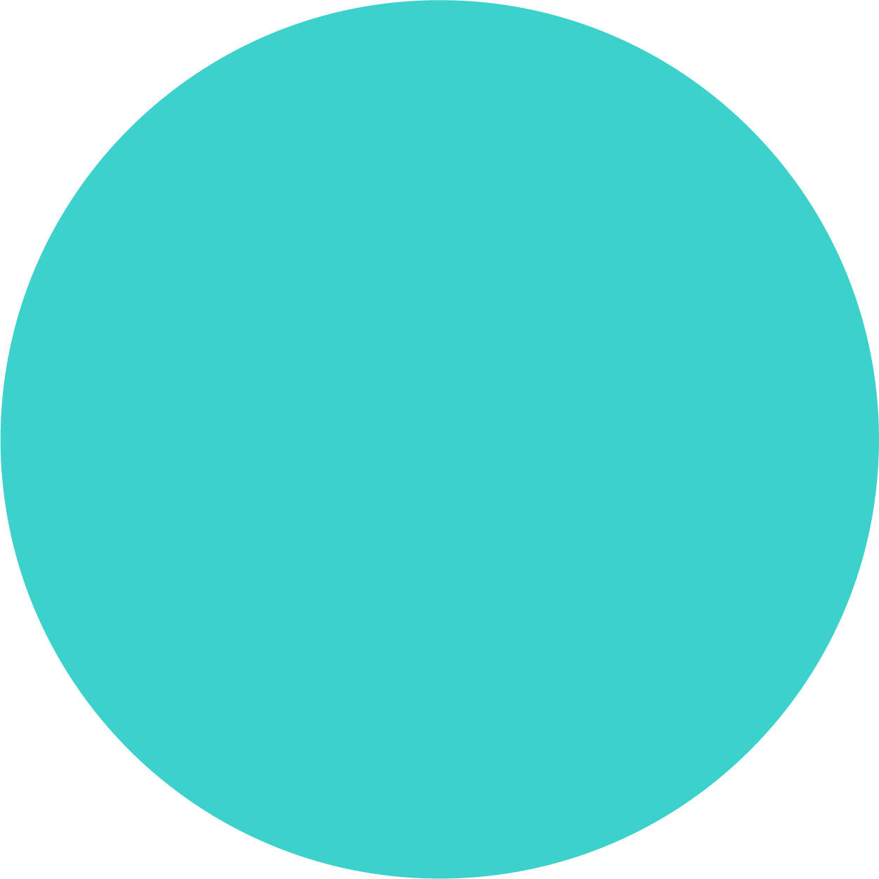
Big Lake
PMS 3265
CMYK 75/0/43/0
RGB 61/209/204
Hex #3DD1CC
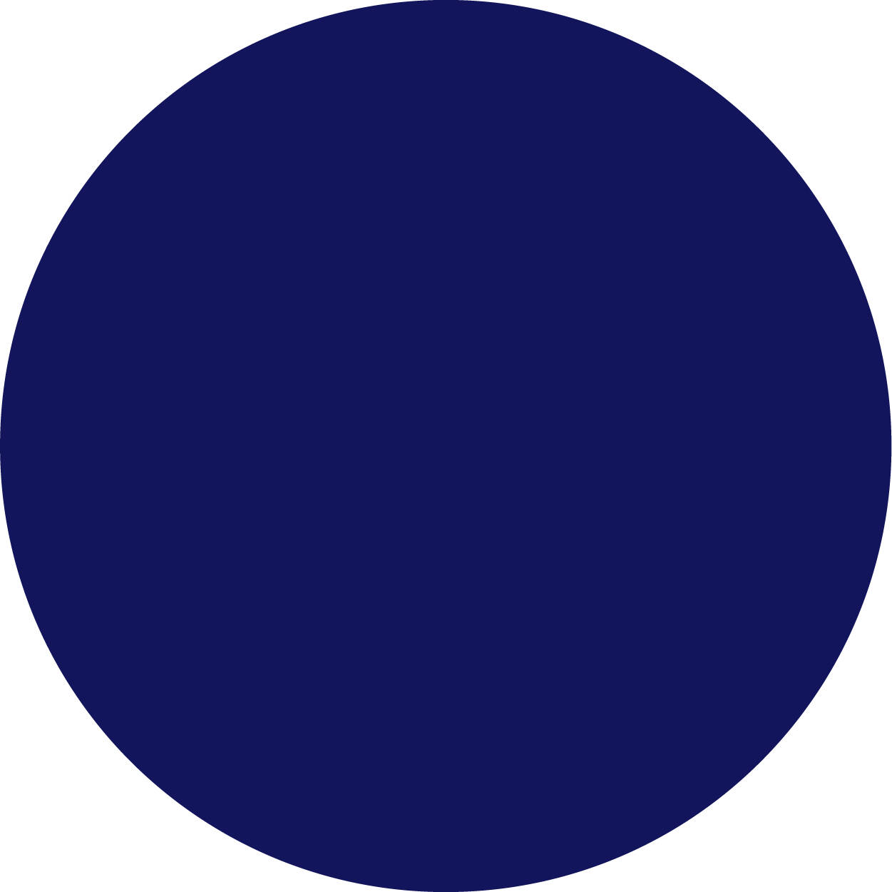
Midnight
PMS 655
CMYK 100/73/0/61
RGB 19/21/92
Hex #13155C
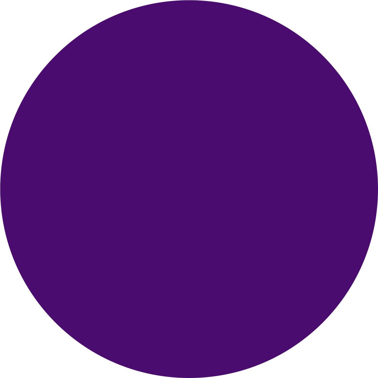
Arboretum
PMS 2091
CMYK 91/100/0/0
RGB 74/12/110
Hex #4A0C6E
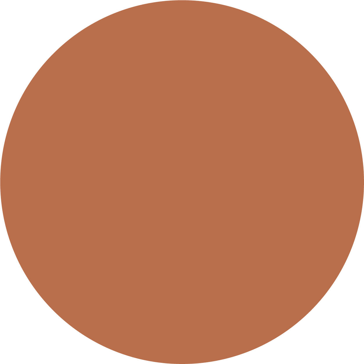
Carillon Brick
PMS 4265
CMYK 14/57/63/28
RGB 186/111/76
Hex #BA6F4C
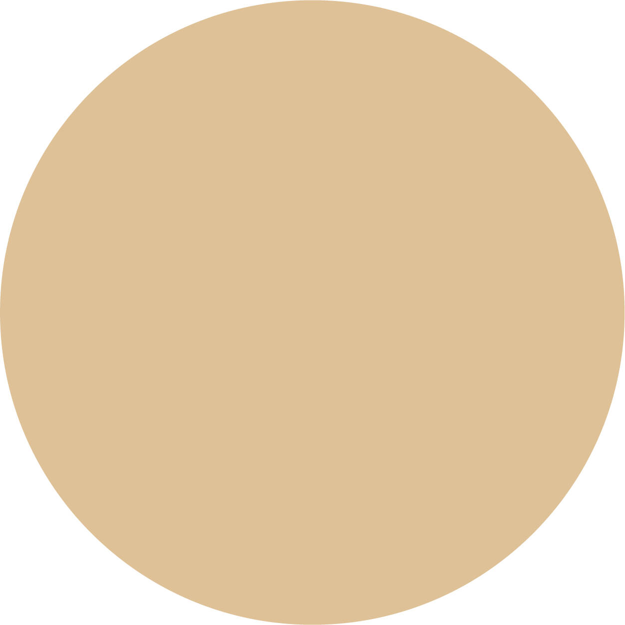
Archway
PMS 4247
CMYK 13/18/26/0
RGB 222/193/151
Hex #DEC197
Using Color
- Lead with GVSU Blue
- Consider your audience and their familiarity with GVSU (less familiar = more blue; more familiar = less blue)
- Consider your message (recruiting students = more blue; on-campus event = less blue)
- Use the provided color breakdowns
- Use PMS or CMYK when designing materials intended for printing
- Use RGB or Hex when designing for digital applications and on-screen viewing
- Maintain enough color contrast for sufficient readability/legibility on printed items
- Ensure color contrast meets WCAG 2.1 AA guidelines for web and digital designs
- Eyedrop or guess at color breakdowns
- Tie meaning solely to color
- Use color combinations that resemble other Michigan/Midwest universities' visual identities
Color Accessibility
Color combinations in your designs must meet accessibility standards.
When communicating emphasis or hierarchy, use size, shape, font weight, or placement in addition to color. Remember, not everyone will be able to differentiate color by itself. Consider those with colorblindness when choosing images and colors, and avoid statements on your website such as “choose the green button to go to the next page.”
Be sure that your colors meet contrast standards in accordance with WCAG 2.1 AA accessibility guidelines. This allows individuals with low visibility to properly distinguish foreground and background colors, especially in text and graphic elements. It is best to check your color choices using a color contrast checker such as the WebAIM Color Contrast Checker.
The following chart shows suggested color combinations that meet accessibility contrast standards. Be especially mindful when using lighter tints of GVSU colors, as they will result in different contrast ratings than their fully saturated versions.