

Primary Logo
Home > Visual Identity > Logos > Primary Logo

Treat the logo as artwork, not as typography or a font. It should not be modified or recreated in any way.
No version of the primary logo may have a department or other words added to it.
Jump to: Components | Setups | Download | Color | Minimum Size | Clear Space | Contrast | Common Mistakes
Components
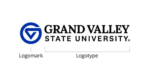
The primary logo has two base components: the logotype and the logomark.
The logotype is the set of characters that form the words “Grand Valley State University”. The logomark is the uniquely-drawn circular shape, previously referred to as "the circle GV". The combination of the logotype and logomark constitutes the university’s primary logo. The logo may include our primary web address, but this is optional.
When the logomark is set to the left of the logotype, the logo is referred to as being "markleft". When the logomark is set above the logotype, the logo is referred to as being "marktop".
Full
The full setup uses the full logotype "Grand Valley State University" adjacent our logomark.
Use the full markleft and full marktop setups whenever possible, especially for audiences outside of Grand Valley.
(A) Full markleft
(B) Full marktop

Full with Tagline
This variation adds the university's tagline below the logotype. Use this version on materials aimed at external audiences and materials that speak to the tagline. This version works best as a "closing" or "sign off" logo. It shouldn't be used as a headline or logo that appears at the top of a page. It is meant to reinforce or support the tagline, not introduce it.
(A) Full with tagline markleft
(B) Full with tagline marktop

Full with URL
This variation adds the university's primary URL below the logotype. Use this version on materials aimed at external audiences when a general URL would benefit the reader.
(A) Full with URL markleft
(B) Full with URL marktop

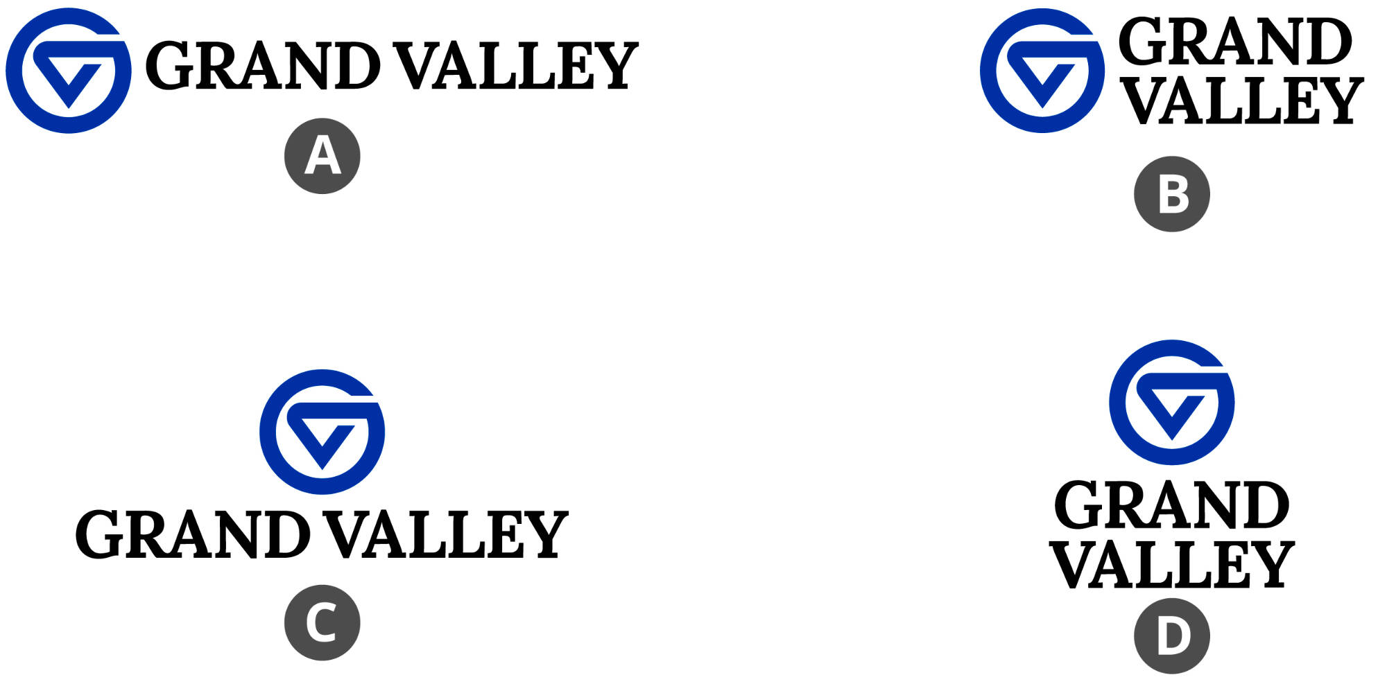
Grand Valley
This variation shortens the logotype to "Grand Valley". Use this version on materials aimed at internal audiences or at those who are already familiar with Grand Valley State University.
(A) Grand Valley markleft
(B) Grand Valley markleft stacked
(C) Grand Valley marktop
(D) Grand Valley marktop stacked
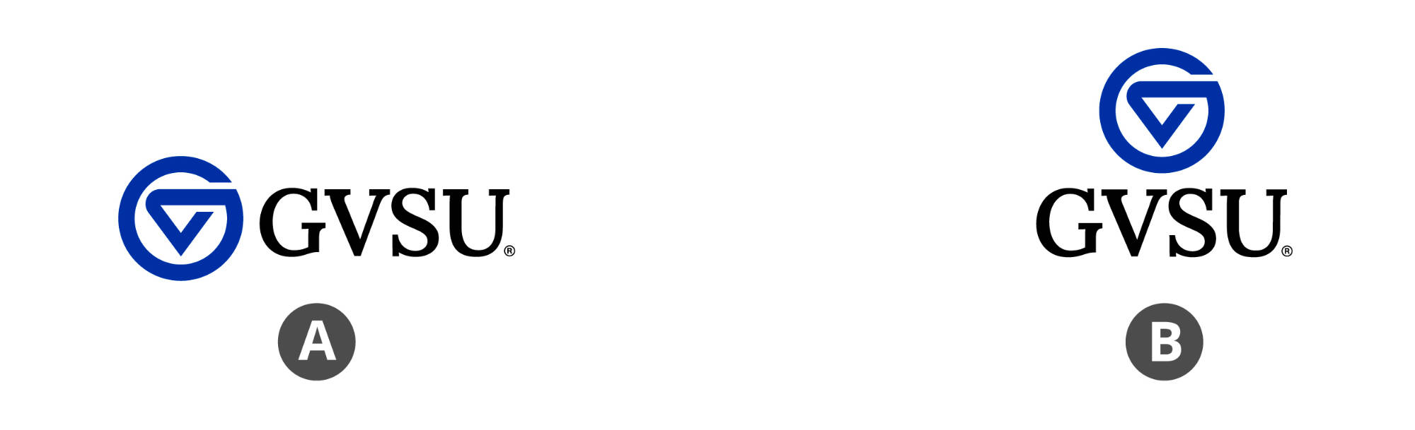
GVSU
This variation shortens the logotype to "GVSU". Use this version on materials aimed at internal audiences or at those who are already familiar with Grand Valley State University, and when space is incredibly limited.
(A) GVSU markleft
(B) GVSU marktop
One Line
This variation places the logomark and logotype together on one long, horizontal line. Reserve use of the full one-line setup for narrow, vertically-restrictive placements. If you have space for the marktop or markleft full logo, use that setup instead.


Primary logos are included in black, GVSU blue, 2-color, and white, in file formats for both print and online use. Requires valid GVSU network login to access.
|
Extension |
Use |
Color Space |
Resolution |
|---|---|---|---|
|
|
Printed items |
CMYK |
Scale to any size without clarity loss. These are created as vector files and fulfill that criteria if required by an outside vendor. |
|
.png |
Screens/digital items |
RGB |
Blurry when scaled larger than 100%. |

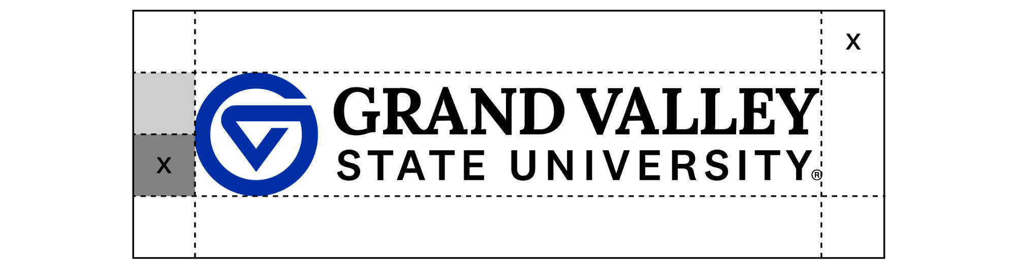
Minimum Size
Minimum height guidelines ensure that the primary logo is legible in all printed and digital media. The minimum size requirements are based on the height of the logomark within the logo.
The logomark must be at least 0.25 inches tall on printed items, or at least 18 pixels tall on digital items.
Specialty production methods like screen printing and embroidery may require larger output than the sizes mentioned here, depending on vendor capabilities and equipment. Always defer to vendor recommendations.

Contrast
Use the primary logo version that provides the strongest contrast against its background.
Special care should be taken when using a primary logo over a photo or patterned background. Avoid photos that make the logo difficult to read. Choose a logo in the color that will stand out best against the photo's colors.
Tip: Add an overlay or gradient over the background to increase contrast between the primary logo and the background.

- Do not stretch, distort, or rotate the logo.
- Do not obscure, delete, or alter any aspect of the complete logo.
- Do not use the logotype without the logomark accompanying it.
- Do not change the logo's color.
- Do not add other artwork to the logo.
- Do not combine the logo with other logos, designs, or marks.
- Do not rearrange or otherwise change any of the parts of the logo to create an alternate version of the logo.
- Do not use the logo on a background that provides insufficient contrast.
- Do not place the logo where a hole-punch or binding may interfere with it.
- Do not reverse the logo out to a color other than white.
- Do not attempt to replicate the logo in a different font.
- Do not add any graphic effects to the logo, such as outlines, gradients, or drop shadows.