

Graphic Elements
Home > Visual Identity > Graphic Elements
Jump to: Logomark | Brand Tagline Graphic | Patterns: Ripple | Patterns: Wave
The Grand Valley logomark is the uniquely-drawn circular shape component used in the Grand Valley Logo. It can serve as a logo or as a graphic element to enhance materials and increase familiarity with our visual identity. These guidelines will address using the logomark as a graphic element on a piece. For guidelines on using the logomark as a logo, please visit our Logos: Logomark page.
The logomark is available to download in black, GVSU blue, and white, in file formats for both print and online use. Requires valid GVSU network login to access.
Using the Logomark as a Graphic Element
Color
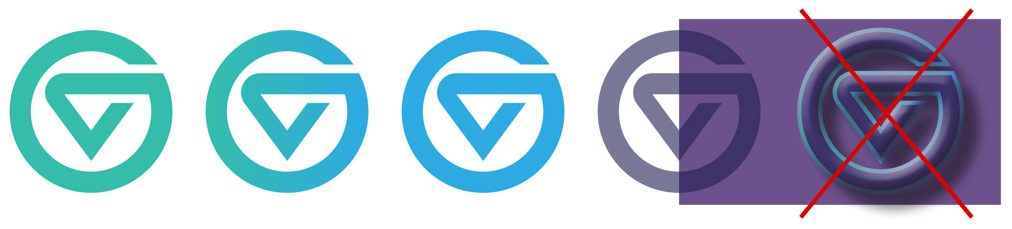
Logomark can be filled with any of GVSU’s colors.
While transparency and gradients are allowed, no additional strokes, drop shadows, bevels, or textures should be added to the logomark.
Note: When used as a logo on a piece, the logomark has different rules regarding color.
Cropping
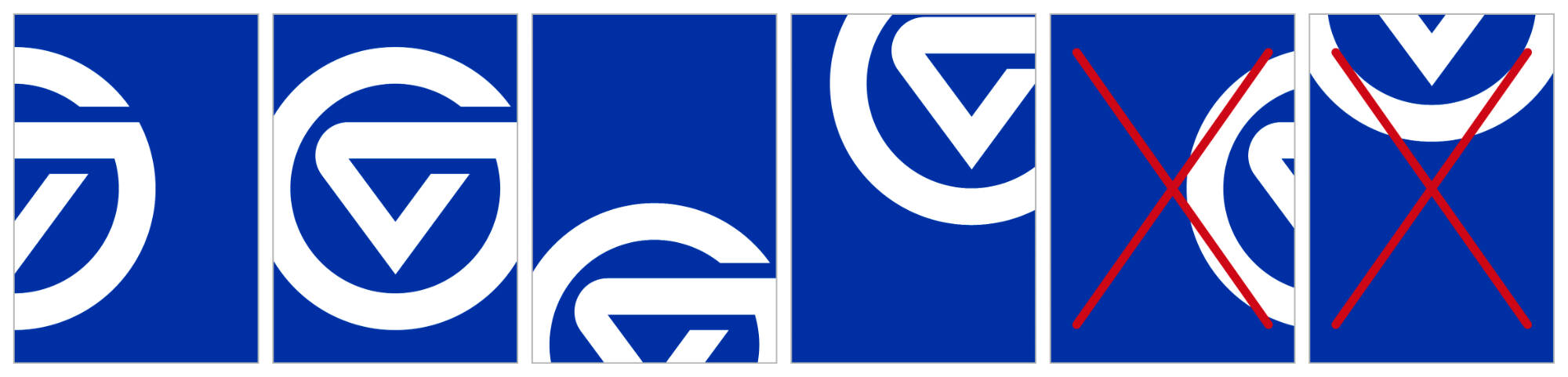
When cropping the logomark off the edge of a composition, at least 50% of the width and height of the logomark must remain visible.
Do not crop the lower half of the logomark if the top of the V is not visible.

Special Effects
The logomark can be placed over photography, but do not use the logomark as a photo container.
Do not put words inside the logomark. Do not apply artificial filters such as bevels or drop shadows to the logomark.
Print finishing treatments such as embossing, debossing, foil stamping, and varnish are allowed. Die-cutting is not recommended due to the structure of the graphic.
Clear Space
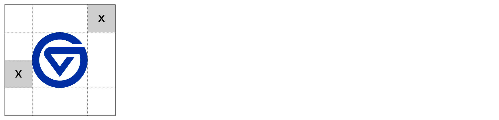
The logomark requires clear space. Clear space is the amount of empty space surrounding the logomark.
Do not place other graphics or text in the clear space. The amount of clear space should equal 1/2 the height of the logomark and is required on all sides of the mark.
When using the logomark on materials intended for external audiences, be sure to include the appropriate primary, secondary, or tertiary logo on the piece as well.
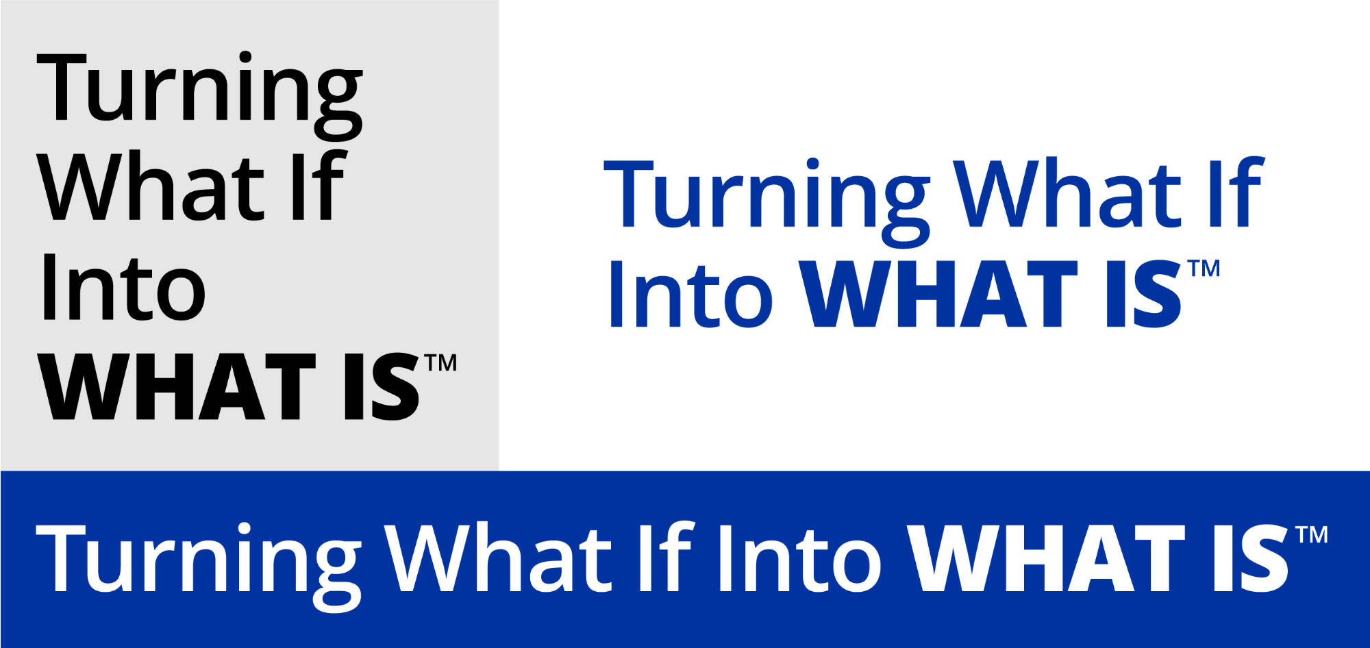
The brand tagline graphic can be used on materials that speak to the Grand Valley brand. It can be used alone as a primary message or placed in a layout as a graphic element.
The tagline graphic does not take the place of a Grand Valley logo. Any piece employing the tagline graphic requires the existing presence of a Grand Valley logo. Do not alter the tagline graphic.
The brand tagline graphic is available for download in black, GVSU blue, and white, in file formats for both print and online use. Requires valid GVSU network login to access.
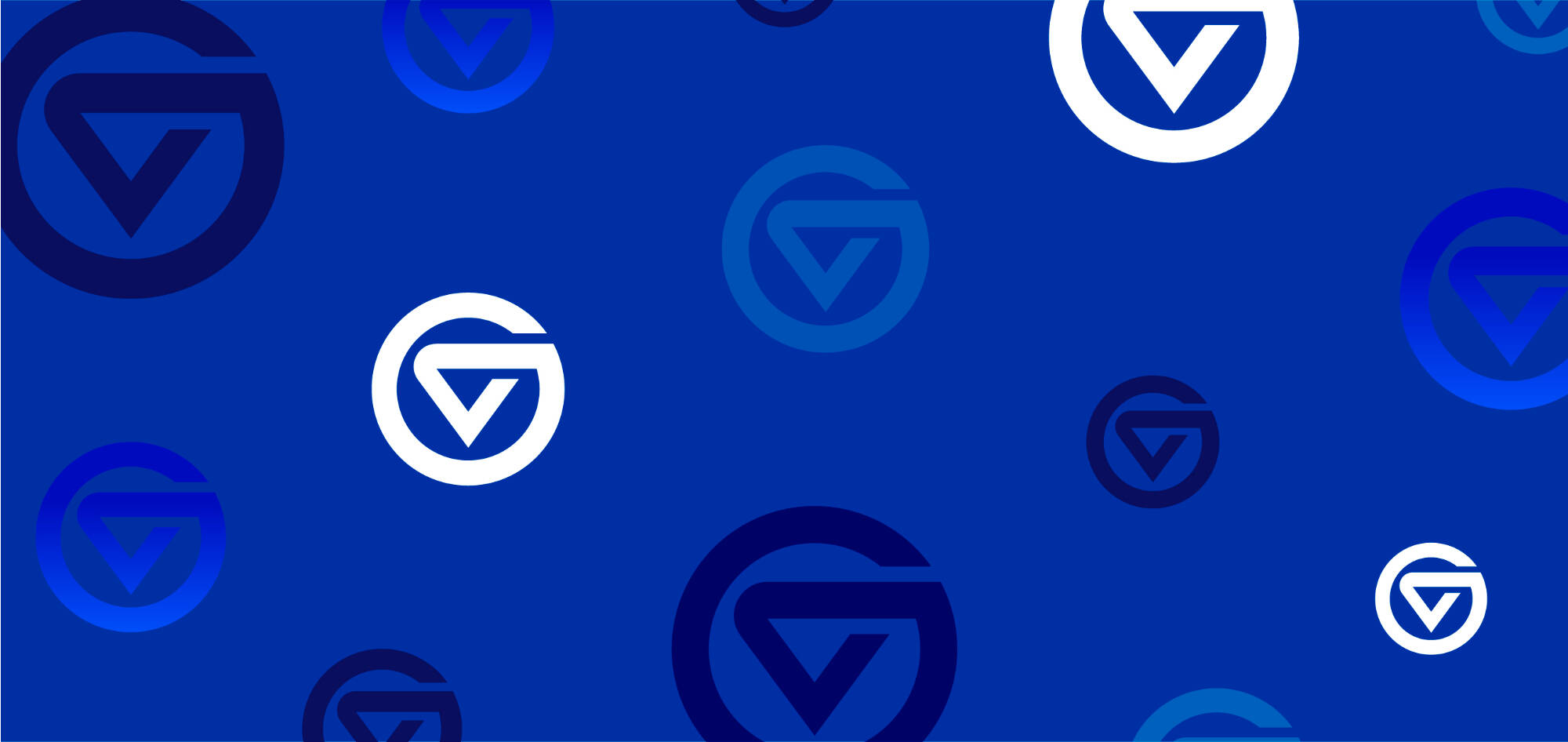
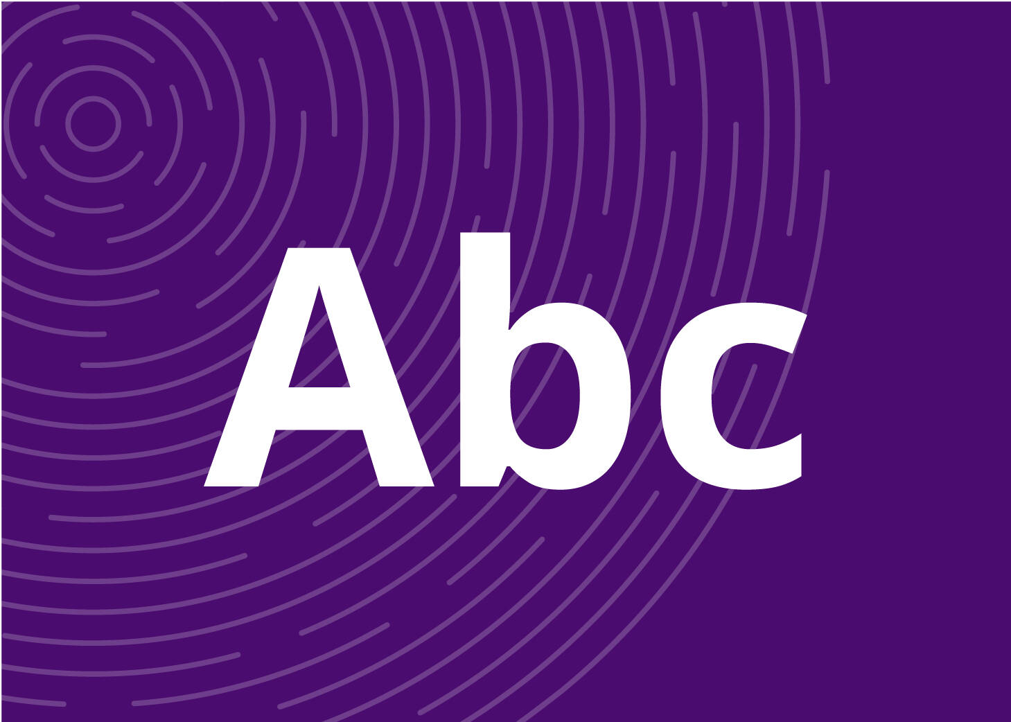
The ripple pattern is a nod to our identity as Lakers, our proximity to Lake Michigan, and the transformative ripple effect of a Grand Valley education.
The ripple pattern graphic is available to download in file formats for both print and online use. Requires valid GVSU network login to access.

Using the Ripple Pattern Graphic


Color
The ripple pattern graphic can be used to enhance images using any combination of our colors.
Placement
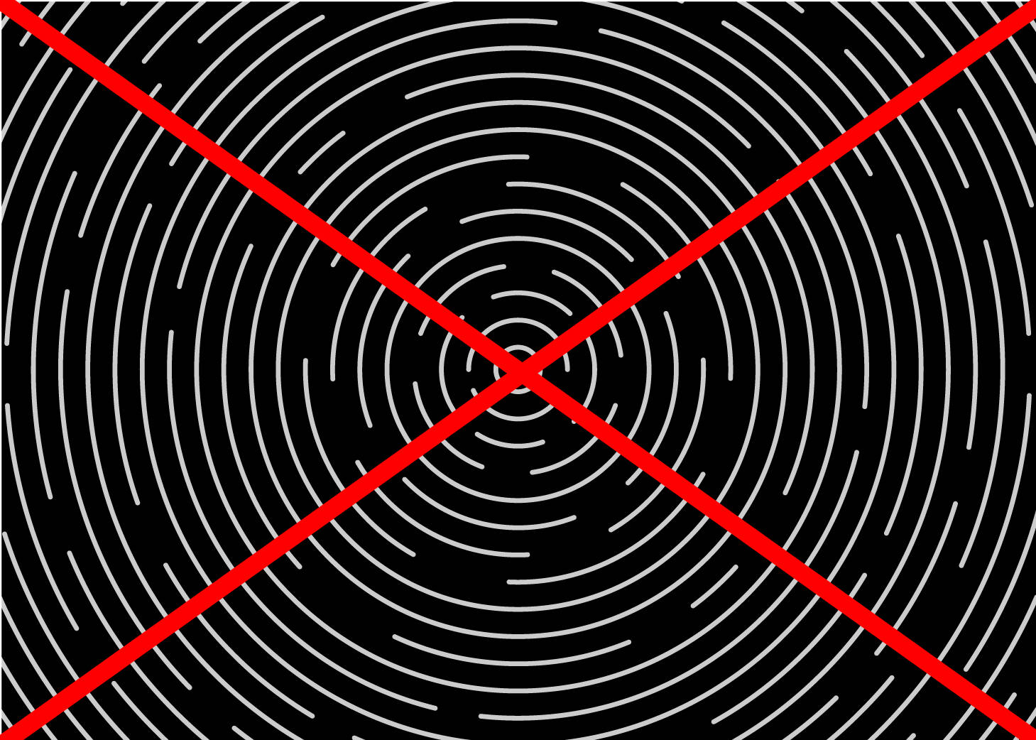
The ripple pattern graphic works best tucked into a corner rather than completely filling a container.

Behind Text
The ripple pattern can be used behind large text as long as it continues to meet accessibility color contrast standards. Text weight should be at least 2x the line width used in the ripple. Small text over the pattern is not recommended.
Contrast/Opacity
The ripple pattern works best at medium-to-low contrast. This example uses the ripples in white at 40% opacity. The ripple pattern is not recommended at high contrast, snapped to center, or fully filling a page.
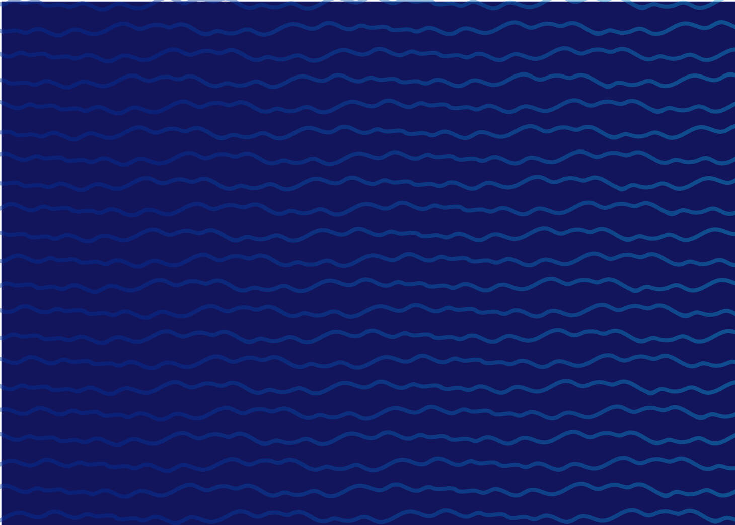
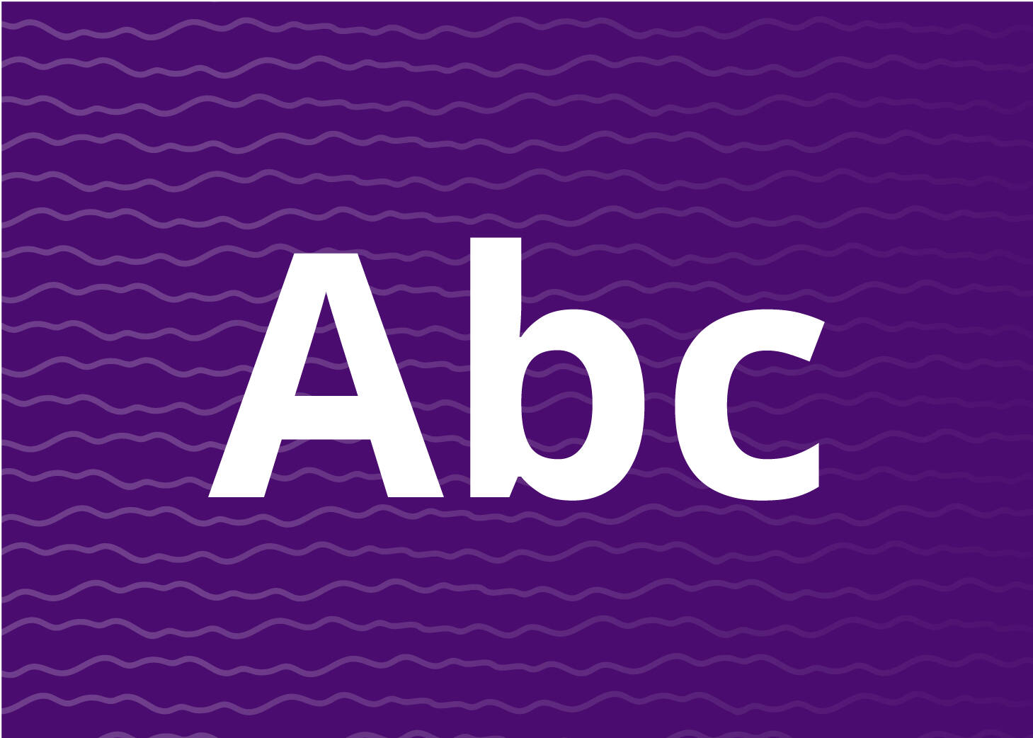
The wave pattern is inspired by aerial path carved by the Grand River between our Valley and City campuses. It is intended to be used as a subtle element, adding texture and interest to backgrounds on your materials.
The wave pattern graphic is available to download in file formats for both print and online use. Requires valid GVSU network login to access.

Using the Wave Pattern Graphic
Color
The wave pattern graphic can be used to enhance images using any combination of our colors.
Behind Text
The wave pattern can be used behind large text as long as it continues to meet accessibility color contrast standards.

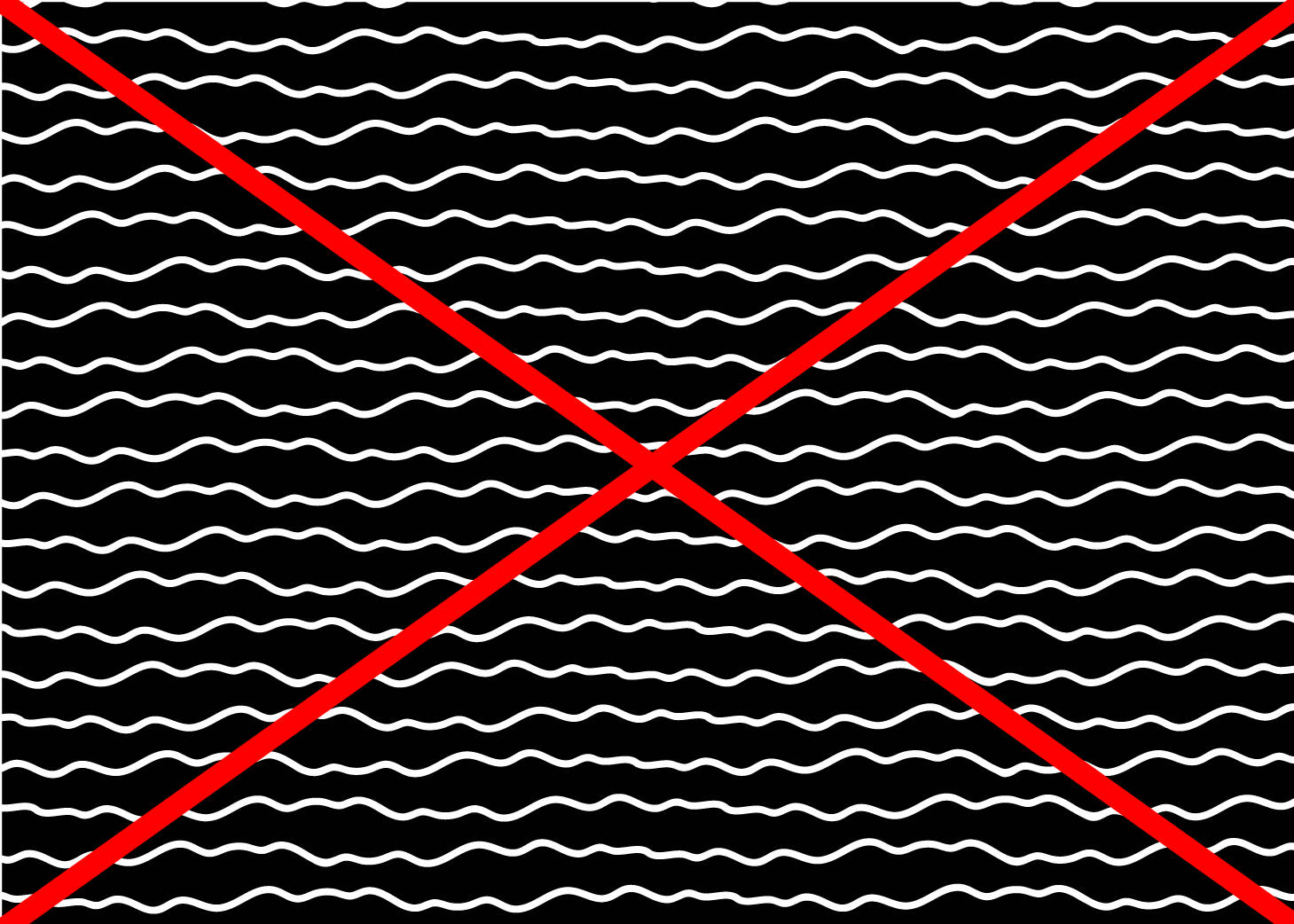
Contrast/Opacity
The wave pattern works best at medium-to-low contrast. The wave pattern is not recommended at high contrast.
Additional Resources
iStock.com and thenounproject.com are online resources with icons, illustrations, and additional graphics available.