

Typography
Home > Visual Identity > Typography
Using our chosen typefaces consistently and thoughtfully is important for a cohesive brand presence.
Primary Typefaces
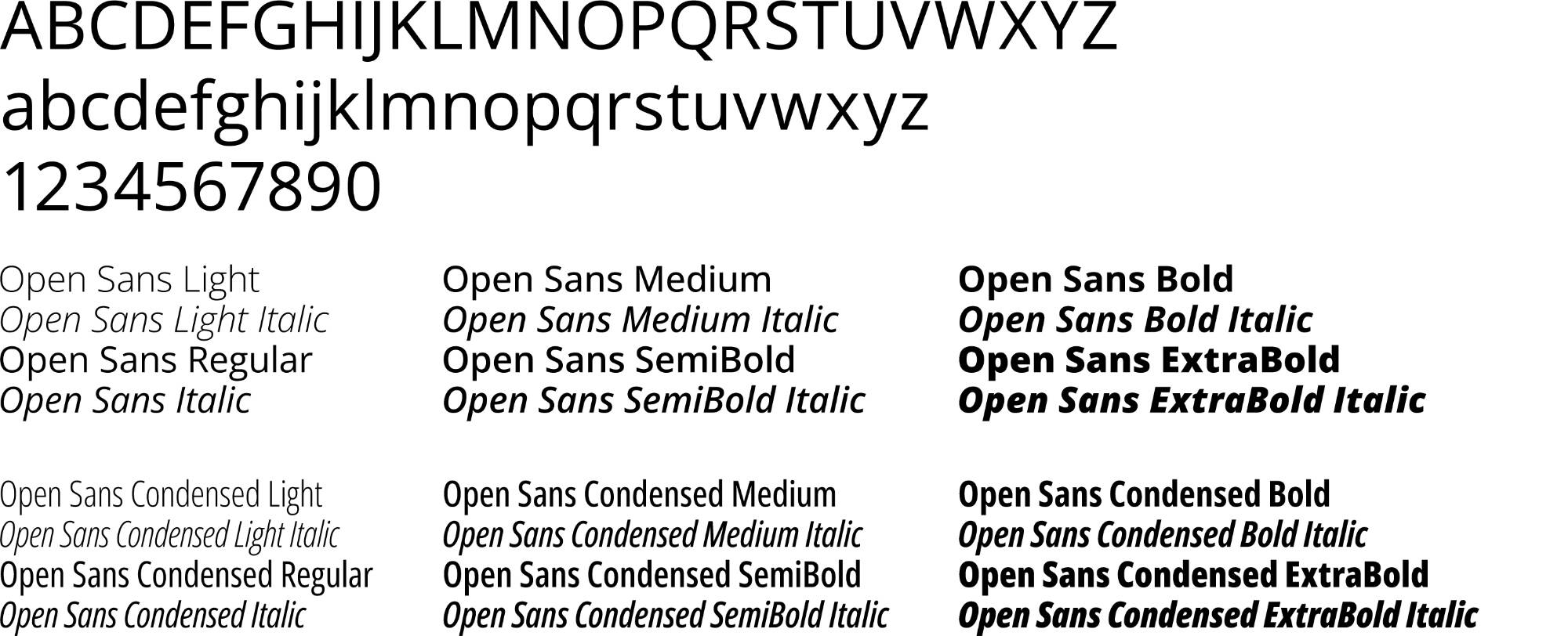
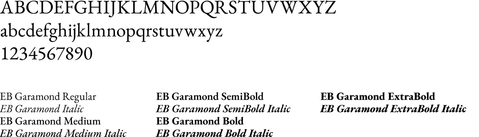
Grand Valley has two primary typefaces: Open Sans and EB Garamond. Open Sans is our primary sans serif and EB Garamond is our primary serif. You may use these together or independently of each other.
Both type families are available for free download from Google Fonts.
Open Sans
EB Garamond
System Typefaces
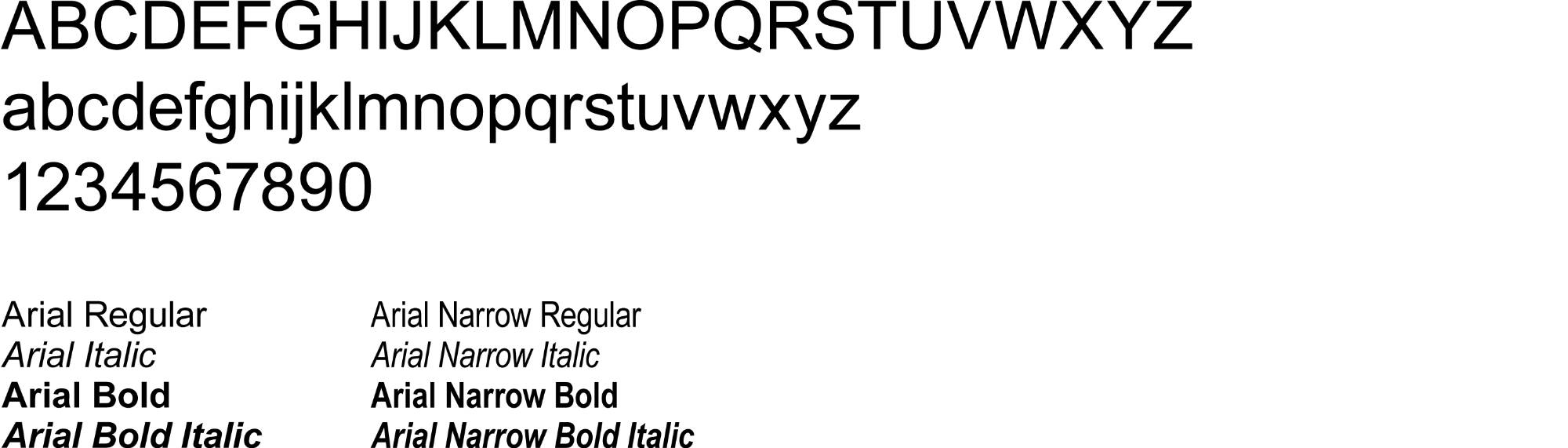
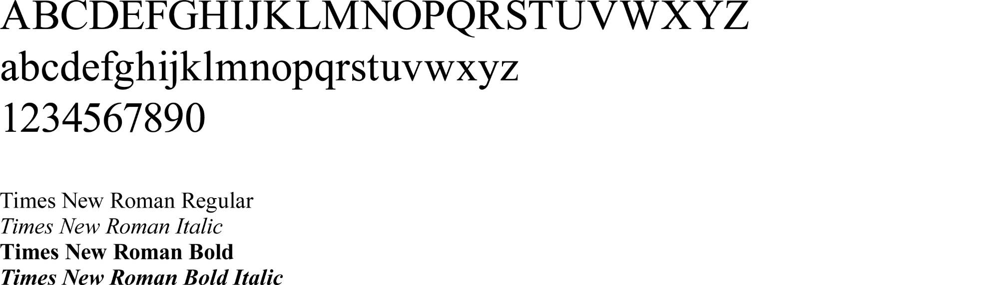
If you are unable to acquire and/or use one of Grand Valley’s primary typefaces, there are two system fonts approved for use: Arial and Times New Roman. These are typically available by default on most computers.
Arial
Times New Roman
Using Type
Do:
- Limit the number of styles and sizes to create consistency and support the visual hierarchy
- Include plenty of surrounding white space
- Aim for balance when choosing your text's leading and kerning settings
Don't:
- Use all capitals in blocks of type of four lines or more
- Condense or expand text by stretching it
- Overuse emphases — if too many things are emphasized, nothing stands out
- Use drop shadows on blocks of text
- Use outlined type on blocks of text
PREVIOUS SECTION
NEXT SECTION
Page last modified June 10, 2026