Navigation Menu
A website navigation menu is vital for user interaction, offering a structured pathway to access various sections of a website. It includes links to essential pages or features, ensuring smooth navigation and enhancing usability. This guide will walk you through best practices to use when setting up your website's structure and navigation.
Creating a Navigation Menu
Adding a Menu to Your Site
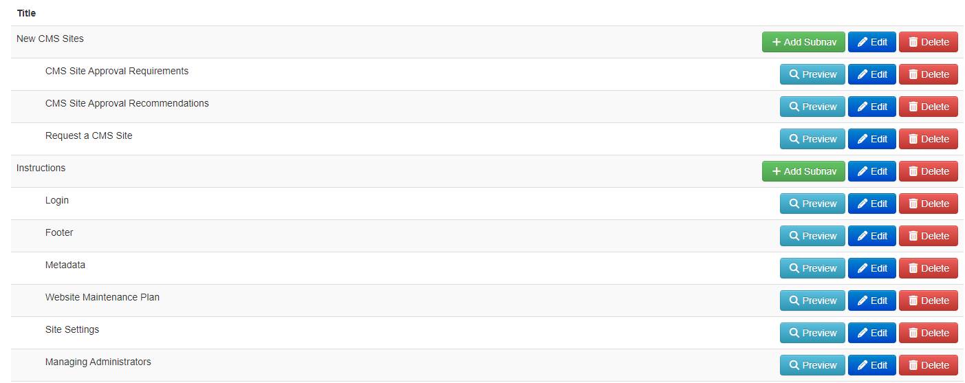
- Once logged in to your site in the CMS, click Navigation from the left menu.
- Click the green + New Item button.
- Add the title (what will appear on your site) to navigation menu.
- Choose the navigation type from the available options.
- Choose what the navigation item will link to (page on site, external link, etc.).
- Place the navigation item in the order you prefer in the menu.
Pros and Cons of Horizontal vs. Vertical Navigation
How to Change Your Site's Navigation Orientation
To change your site's navigation from horizontal to vertical, view instructions in the Site Settings Guide.
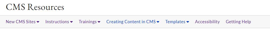
Horizontal Navigation
A horizontal navigation menu for a website is a layout where menu items, typically links or categories, are arranged side by side along the top of the webpage, facilitating navigation from left to right.
Pros of Horizontal Navigation:
-
Space Efficiency: Horizontal navigation tends to make efficient use of screen width, allowing more room for content. This can be beneficial for websites with a significant amount of horizontal space available.
-
Familiarity: Many users are accustomed to horizontal navigation as it aligns with the traditional layout of menus in physical environments. This familiarity can enhance user experience and ease of navigation.
Cons of Horizontal Navigation:
-
Challenges with Many Items: If your website has an extensive menu, a horizontal layout may become cluttered and challenging to navigate, especially if it results in small text or cramped spacing between items.
Example of Horizontal Navigation
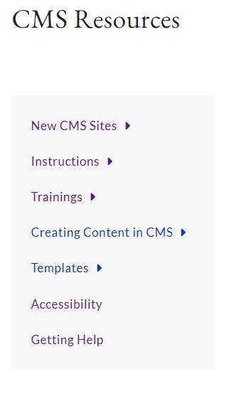
Vertical Navigation
A vertical navigation menu is a website layout where menu items are arranged in a column, usually on the left or right side of the webpage, allowing for navigation from top to bottom.
Pros of Vertical Navigation:
-
Vertical Scrolling is Natural: Users are generally more accustomed to vertical scrolling, making it a natural and expected behavior. Vertical navigation aligns well with the standard user interaction on websites.
-
Effective for Deep Hierarchies: Vertical navigation is often more suitable for websites with deep hierarchical structures, as it allows for easy expansion and nesting of menu items without crowding the interface.
Cons of Vertical Navigation:
-
Limited Horizontal Space: In contrast to horizontal navigation, vertical menus can occupy a significant portion of the screen's height, potentially limiting the space available for content, especially on smaller screens.
-
Perceived Slower Scrolling: Some users might perceive vertical scrolling as slower or less efficient than horizontal navigation, particularly if they need to scroll extensively to find specific menu items.
Example of Vertical Navigation
5 Tips for Setting Up Your Site's Navigation
1. Prioritize Key Pages
Place important pages like "Home," "About Us," and "Contact" at the forefront for easy access, while using clear labels for a straightforward user experience.
2. Grouping
Streamline navigation by grouping related pages under logical categories, enhancing user efficiency and presenting content cohesively.
3. Concise Labels
Ensure quick comprehension by using concise and clear labels for menu items, contributing to a user-friendly interface.
4. Limit Menu Items
Prevent user overwhelm by limiting menu items to focus on critical sections, maintaining a clean and organized navigation menu.
5. Regular Updates
Keep the navigation menu relevant by regularly reviewing and updating it to reflect changes in content and user preferences for an up-to-date and efficient user experience.