Node Editor
Sections
A section allows you to organize content (i.e.: any number of chunks) while controlling spacing, margins, and backgrounds. When editing a section you can control both the number of columns and number of rows it will have. Please note that on small screens (eg: cell phones and small tablets) all chunks will be 100% wide and stacked vertically (top to bottom) regardless of your layout.
General
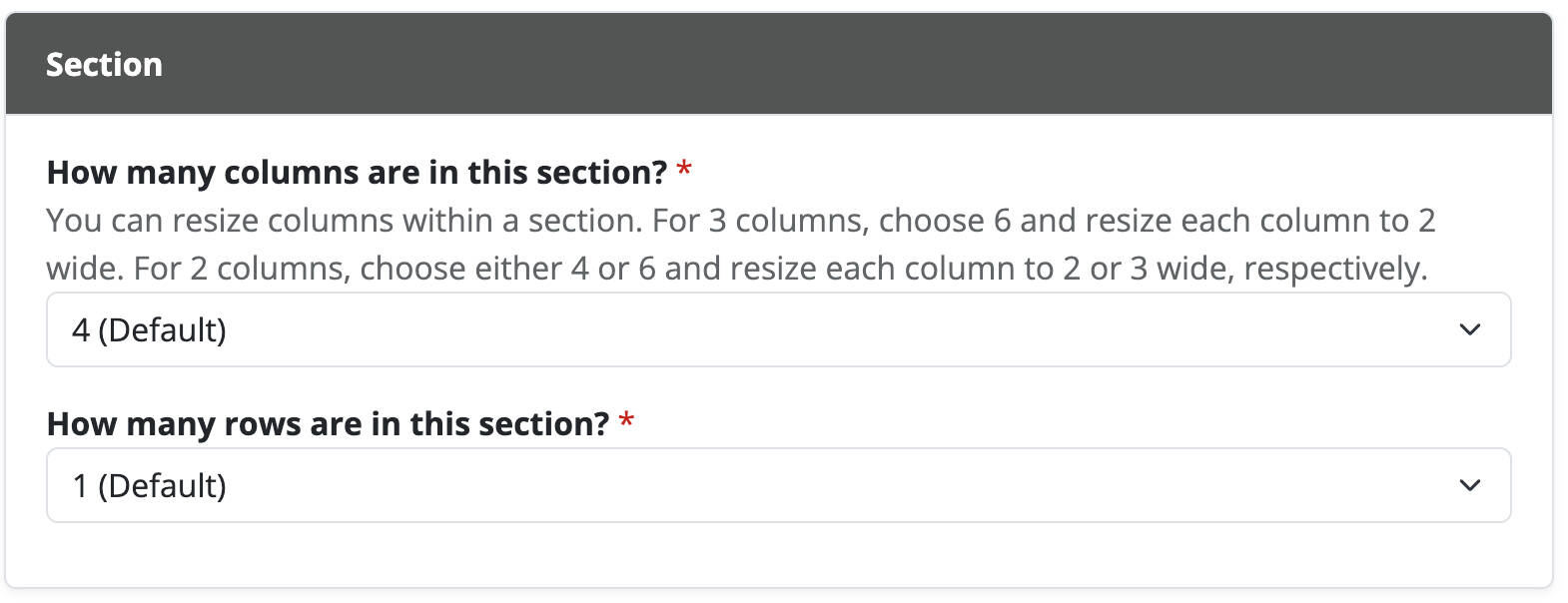
Columns
When editing a section you can choose 4, 5, or 6 columns. Columns are the maximum number of items horizontally (left to right). Chunks can be horizontally resized within a section, so if you want 3 items of equal widths you would pick 6 columns and resize each item to 2 wide.
Rows
When editing a section you can choose 1-6 rows. Rows are the maximum number of items vertically (top to bottom). Chunks can be vertically resized within a section, and may have different or same heights as their neighbors.
Background
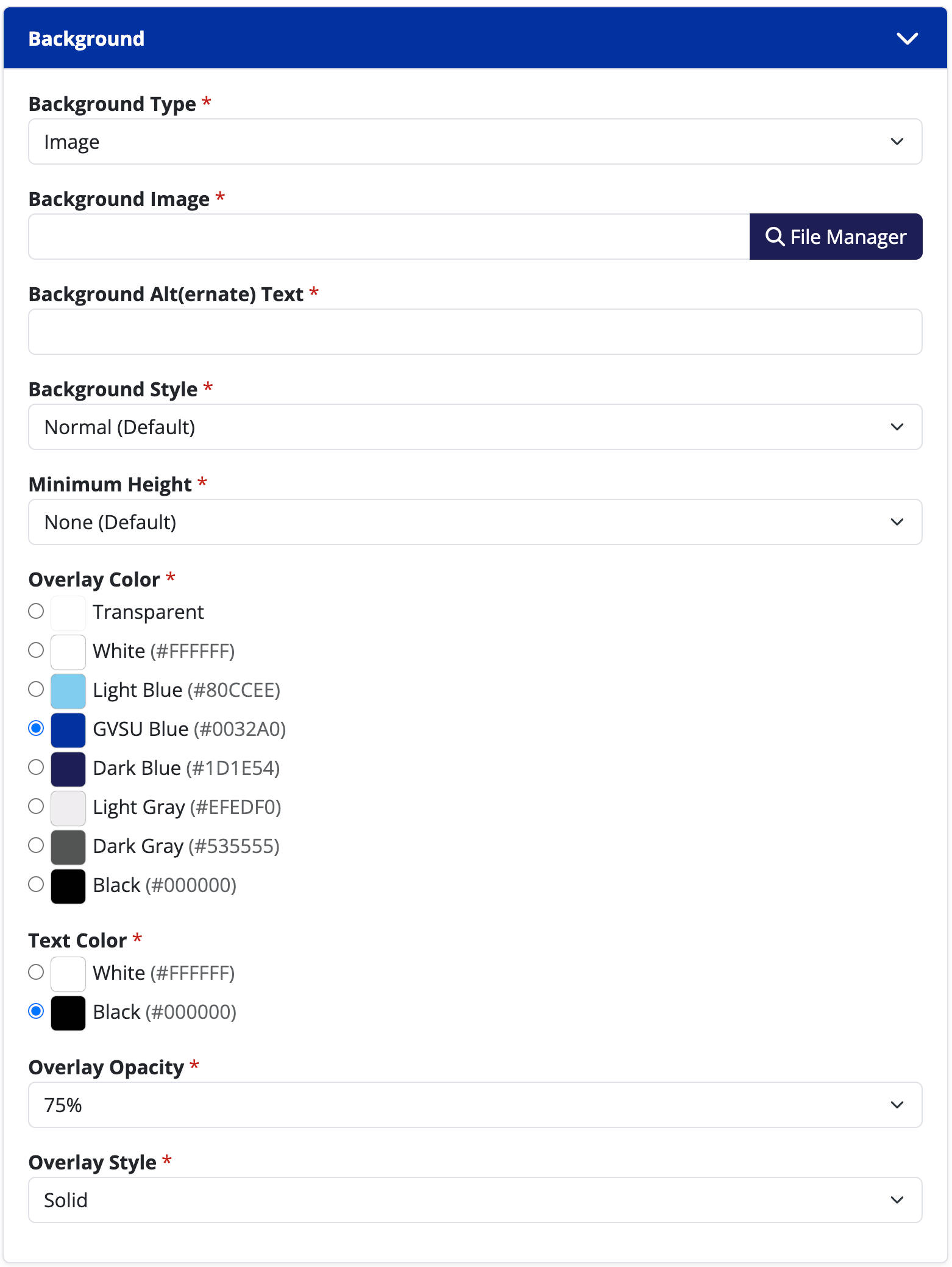
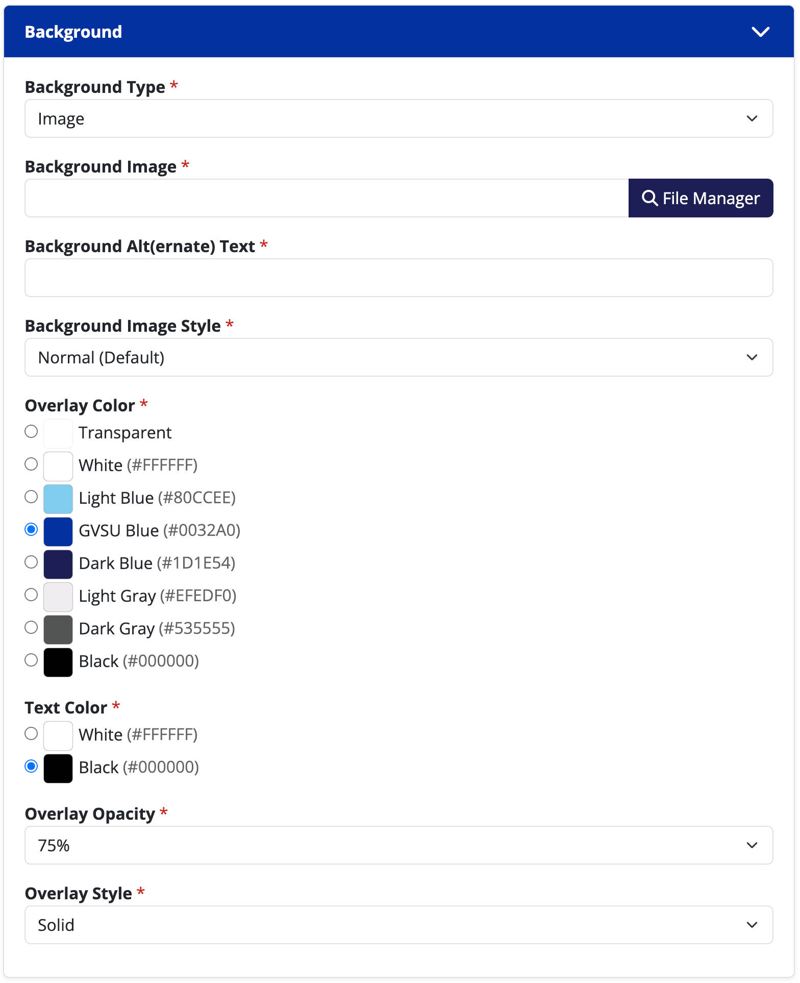
Background Type
The background of a section can be transparent, a solid color, an image, or a video.
- Transparent (Default): Does not have additional options.
- Color: Pick an option from a curated list of GVSU approved colors. Your text color will automatically change to comply with Web Content Accessibility Guidelines (WCAG)'s color ratios.
- Image: Select a picture from your site's file manager.
- Video: Provide a YouTube URL, Vimeo URL, or upload your own video file with an .mp4 extension.
Background Image
This option is only available when selecting a background type of "Image".
Background Alt(ernate) Text
This option is only available when selecting a background type of "Image" or "Video". Alt text is descriptive text that conveys the meaning and context of the image or video content which screen readers use to portray the meaning of the image to those with vision disabilities.
Video Aspect Ratio
This option is only available when selecting a background type of "Video". Most modern videos have a widescreen aspect ratio of 16:9, but if not, can be adjusted here. If you use the wrong aspect ratio your users may notice black boxes around your video.
Background Style
- Normal (Default)
- Parallax: The background image will visually scroll independently of the window's scroll, giving it a three-dimensional effect.
- Full Height: The section will be as a tall as the background's height. Depending on screen resolutions, the left and right edges of the background may be cropped so that the background covers the available space.
Minimum Height
This option is only available when selecting a background type of "Color", "Image", or "Video". This option is not available with a background style of "Full Height".
- None (Default): The section (and its background) will only be as tall as the content within it.
- 100% of Window Height: The section (and its background) will have a minimum height of your browser's window.
Vertical Grid Position
This option vertically positions the grid of items within this section's available height. The options are: top, middle, bottom. This option is only available when selecting an option for minimum height when the background type is "Color", "Image", or "Video".
Background Color
This option is only available when selecting a background type of "Color". You may select from a curated list of GVSU approved colors. Your text color will automatically change to comply with Web Content Accessibility Guidelines (WCAG)'s color ratios.
Overlay Color
This option is only available when selecting a background type of "Image" or "Video". You may select from a curated list of GVSU approved colors.
Text Color
This option is only available when selecting a background type of "Image" or "Video". You should select the text color that has the highest contrast ratio with your background. Only use backgrounds that meet Web Content Accessibility Guidelines (WCAG)'s color contrast ratio requirements.
Overlay Opacity
This option is only available when selecting an overlay color when the background type is "Image" or "Video". A higher opacity will overlay a darker shade of your selected color, whereas a smaller opacity will overlay a lighter shade.
Overlay Style
This option is only available when selecting an overlay color when the background type is "Image" or "Video".
- Solid: The overlay color will evenly fill the entire background.
- Vignette: The overlay color will only be visible on the edges of the photograph.
- Top: The overlay color will be darkest at the top, and gradually fade to transparent.
- Bottom: The overlay color will be darkest at the bottom, and gradually fade to transparent.
- Right: The overlay color will be darkest at the right, and gradually fade to transparent.
- Left: The overlay color will be darkest at the left, and gradually fade to transparent.
Layout
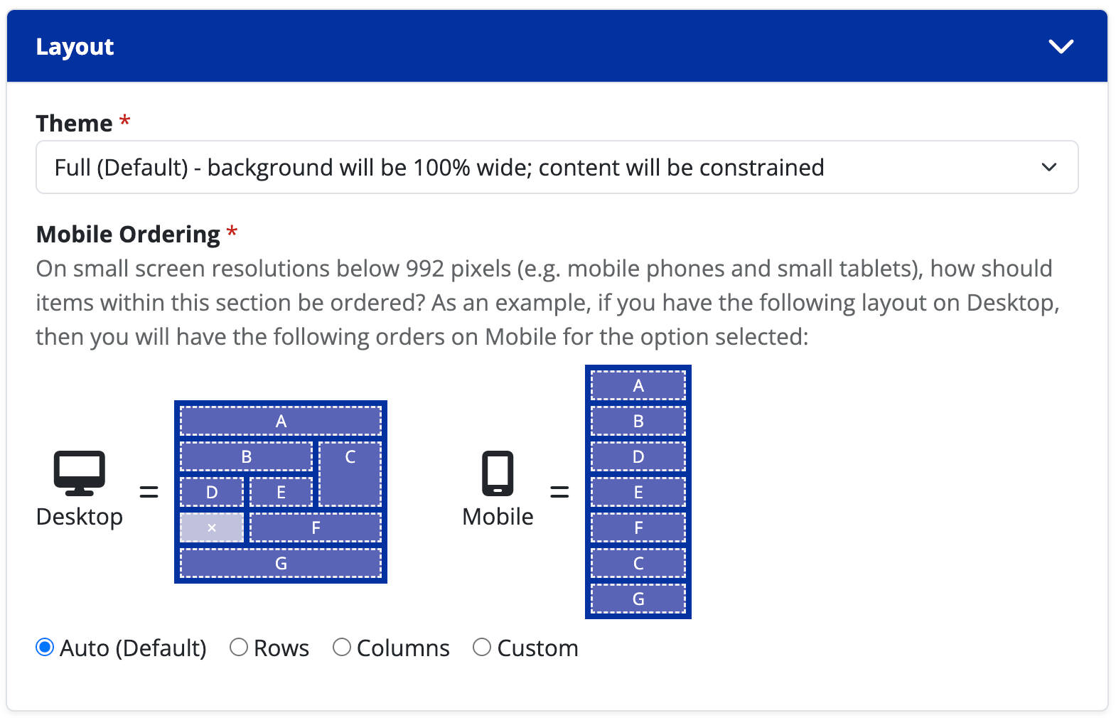
Theme
The theme will dictate how the left and right margins of the section behave.
- Constrained: Background and content will be constrained. This means if you are using a background color, the left and right margins will always be white.
- Full (Default): Background will be 100% wide; content will be constrained. This means if you are using a background color, the left and right margins will be the color, but the content will not be flush to the edges. This option should be used for most cases.
- Responsive: Background will be 100% wide; content will be 100% wide. This means if you are using a background color, the left and right margins will be the color, and the content will be flush to the edges. Use this option if you want to bleed content to the edges of the screen.
Mobile Ordering
This is an advanced setting that should be used sparingly. Most cases can be achieved by leaving this option as "Auto (Default)", unless you have a complicated layout.
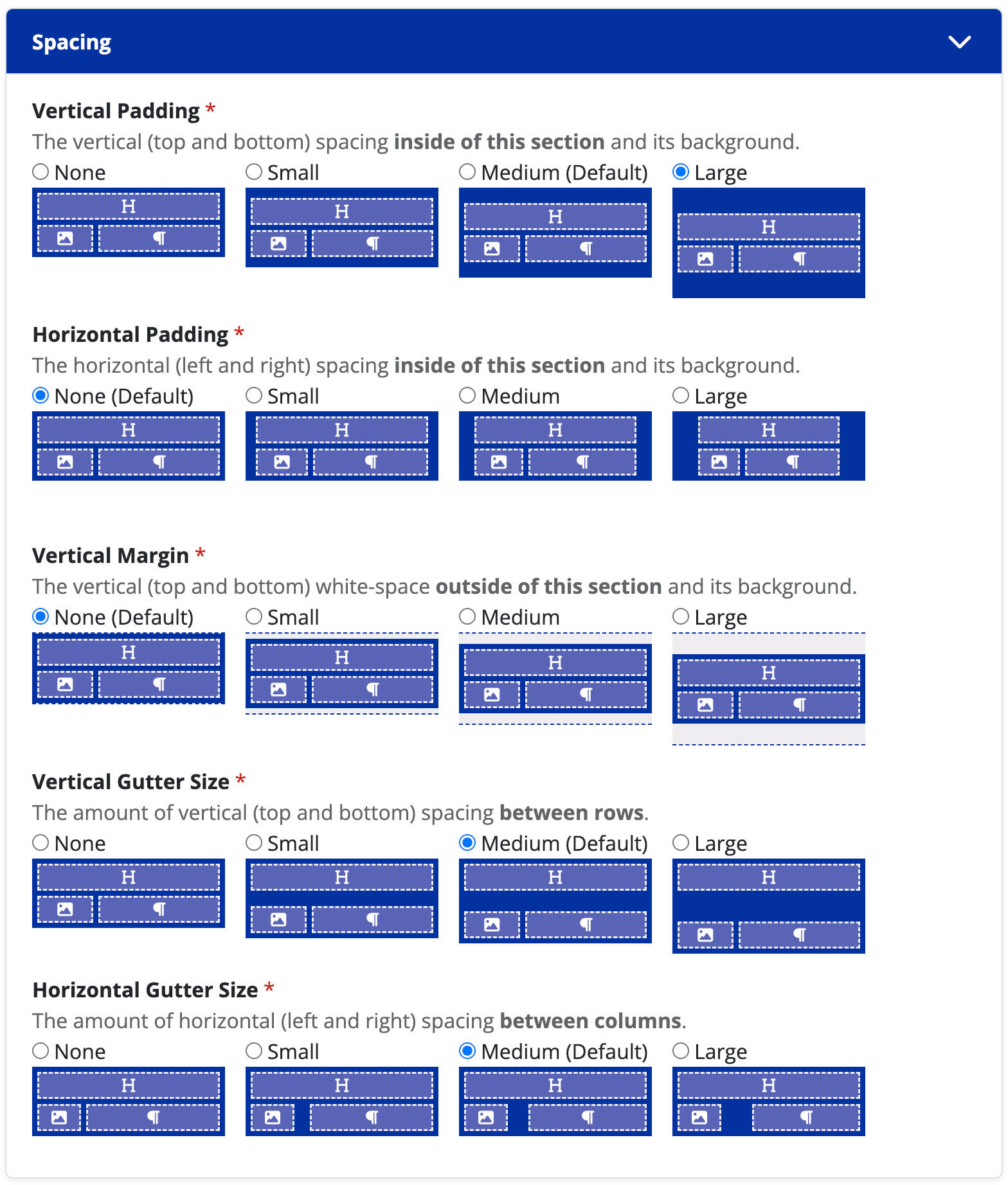
Spacing
Vertical Padding
The vertical (top and bottom) spacing inside of this section and its background.
Horizontal Padding
This option is only available when the layout theme is set to "Constrained" or "Responsive". The horizontal (left and right) spacing inside of this section and its background.
Vertical Margin
The vertical (top and bottom) white-space outside of this section and its background.
Vertical Gutter Size
The amount of vertical (top and bottom) spacing between rows.
Horizontal Gutter Size
The amount of horizontal (left and right) spacing between columns.
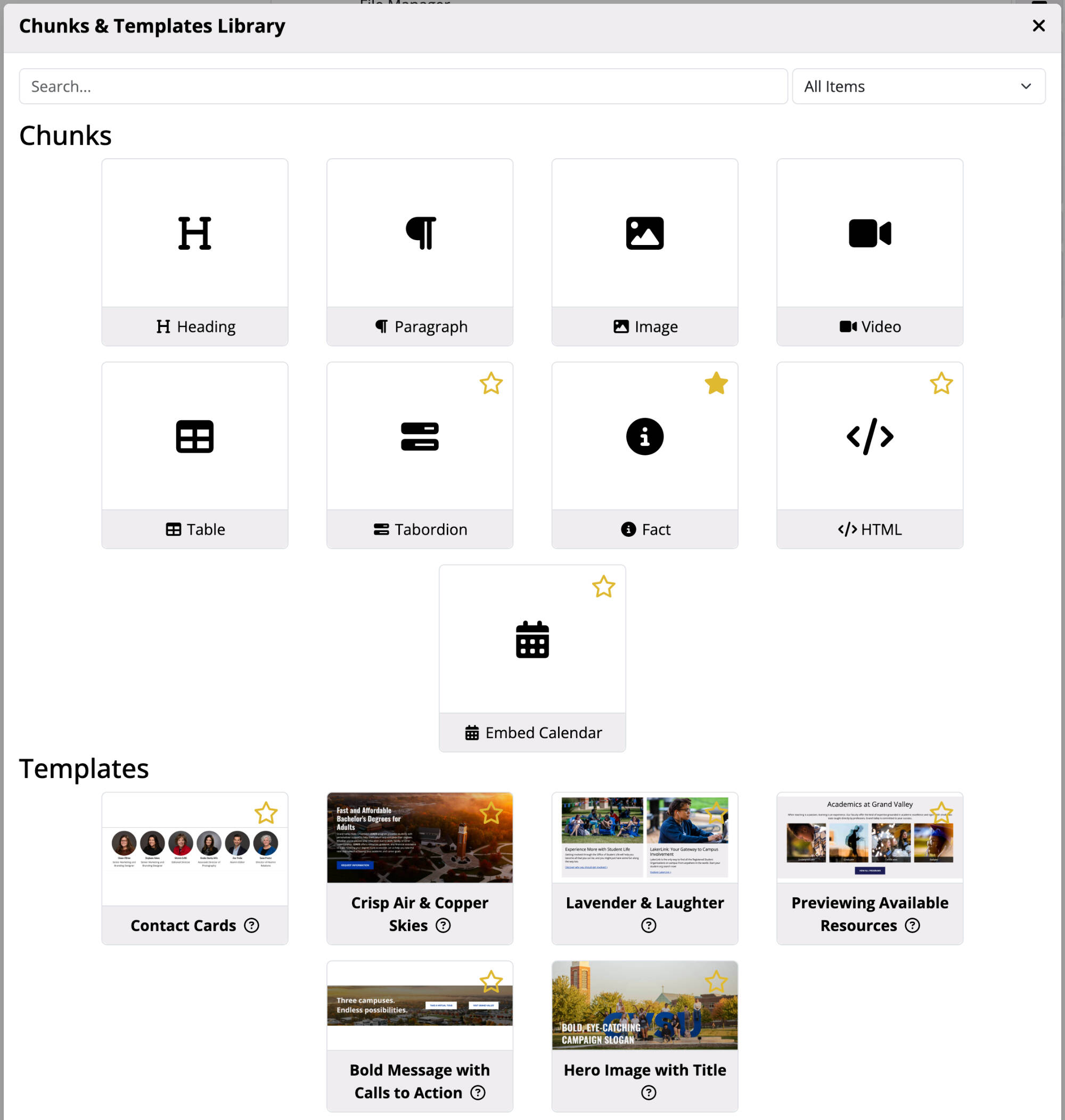
Chunks
In the CMS, each page has different building blocks called chunks that you can easily use to create your web pages. Read through the guide below to understand what each chunk does, when to use it, and how to add it to your page. You can use the menu at the top of this page for quick navigation to a specific chunk or scroll through to see all the available options.
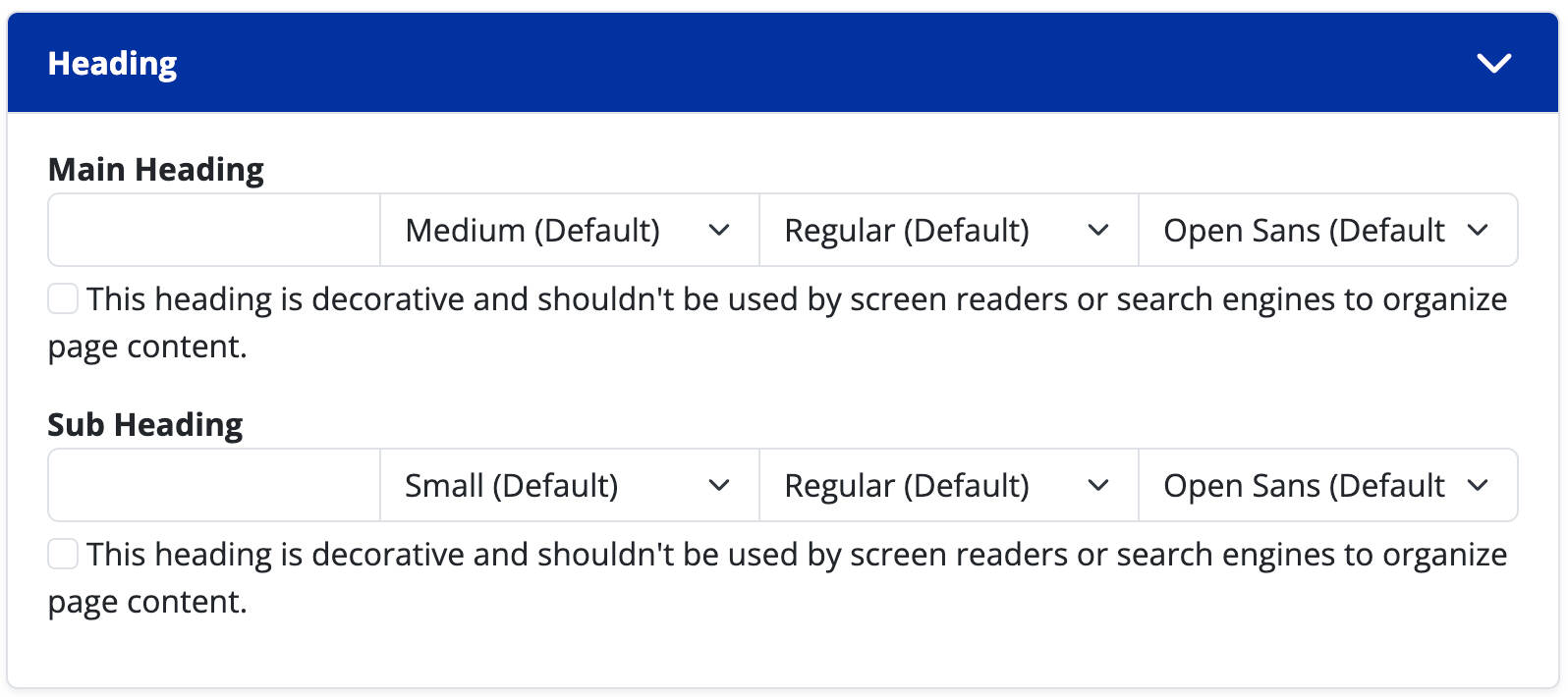
Heading
Main Heading
With the exception of the heading chunk, all headings are optional. A heading will always appear above a chunk's content. A heading's font size, font style, and font family choices are adjustable. If you are using a heading for design purposes (eg: somebody's quote) and not for page structure, please check the option for "this heading is decorative and shouldn't be used by screen readers or search engines to organize page content."
Sub Heading
CMS5 allows you to add a second heading on every chunk for ease of layout design. The options for sub heading are the same as for main heading.
Anchor
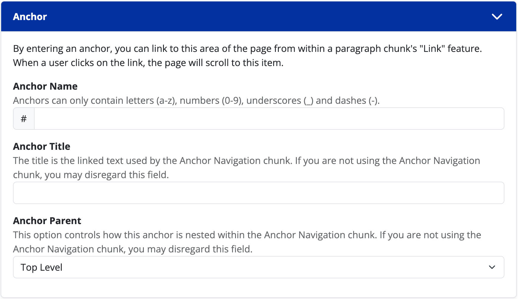
Anchor Name
Anchors are a convenient way to link to a specific area of a web page. By entering an anchor, you can link to this area of the page from within a paragraph chunk's "Link" feature. When a user clicks on the link, the page will scroll to this item.
Anchor Title
The title is the linked text used by the Anchor Navigation chunk. If you are not using the Anchor Navigation chunk, you may disregard this field.
Anchor Parent
This option controls how this anchor is nested within the Anchor Navigation chunk. If you are not using the Anchor Navigation chunk, you may disregard this field.
Background
Background Type
The background of a chunk can be transparent, a solid color, an image, or a video.
- Transparent (Default): Does not have additional options.
- Color: Pick an option from a curated list of GVSU approved colors. Your text color will automatically change to comply with Web Content Accessibility Guidelines (WCAG)'s color ratios.
- Image: Select a picture from your site's file manager.
- Video: Provide a YouTube URL, Vimeo URL, or upload your own video file with an .mp4 extension.
Background Image
This option is only available when selecting a background type of "Image".
Background Alt(ernate) Text
This option is only available when selecting a background type of "Image" or "Video". Alt text is descriptive text that conveys the meaning and context of the image or video content which screen readers use to portray the meaning of the image to those with vision disabilities.
Video Aspect Ratio
This option is only available when selecting a background type of "Video". Most modern videos have a widescreen aspect ratio of 16:9, but if not, can be adjusted here. If you use the wrong aspect ratio your users may notice black boxes around your video.
Background Style
- Normal (Default)
- Parallax: The background image will visually scroll independently of the window's scroll, giving it a three-dimensional effect.
- Full Height: The chunk will be as a tall as the background's height. Depending on screen resolutions, the left and right edges of the background may be cropped so that the background covers the available space.
Background Color
This option is only available when selecting a background type of "Color". You may select from a curated list of GVSU approved colors. Your text color will automatically change to comply with Web Content Accessibility Guidelines (WCAG)'s color ratios.
Overlay Color
This option is only available when selecting a background type of "Image" or "Video". You may select from a curated list of GVSU approved colors.
Text Color
This option is only available when selecting a background type of "Image" or "Video". You should select the text color that has the highest contrast ratio with your background. Only use backgrounds that meet Web Content Accessibility Guidelines (WCAG)'s color contrast ratio requirements.
Overlay Opacity
This option is only available when selecting an overlay color when the background type is "Image" or "Video". A higher opacity will overlay a darker shade of your selected color, whereas a smaller opacity will overlay a lighter shade.
Overlay Style
This option is only available when selecting an overlay color when the background type is "Image" or "Video".
- Solid: The overlay color will evenly fill the entire background.
- Vignette: The overlay color will only be visible on the edges of the photograph.
- Top: The overlay color will be darkest at the top, and gradually fade to transparent.
- Bottom: The overlay color will be darkest at the bottom, and gradually fade to transparent.
- Right: The overlay color will be darkest at the right, and gradually fade to transparent.
- Left: The overlay color will be darkest at the left, and gradually fade to transparent.
Layout
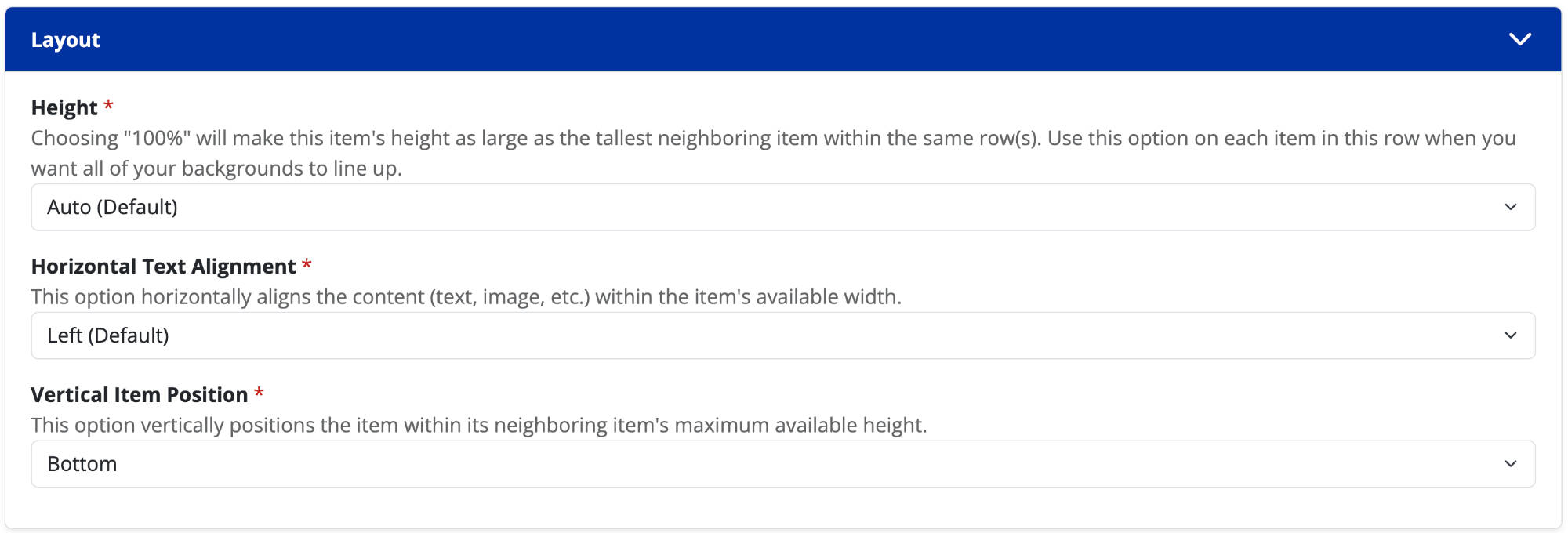
Height
- Auto (Default): The chunk and its background will only be as tall as its content.
- 100%: The chunk and its background will expand to be as tall as its parent section or largest neighboring chunk; whichever is smaller.
Horizontal Text Alignment
The text within a chunk can be horizontally left, center, or right aligned.
Vertical Item Position
This option vertically positions the item within its neighboring item's maximum available height. The options are: top, middle, bottom. This option is only available when selecting a "Height" of "Auto".
Vertical Text Alignment
This option vertically aligns the content (text, image, etc.) within the item's available height. The options are: top, middle, bottom. This option is only available when selecting a "Height" of "100%".
Spacing
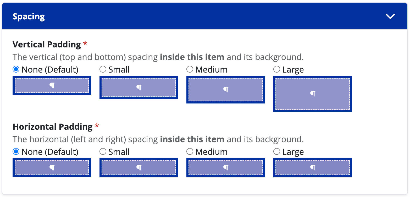
Vertical Padding
The vertical (top and bottom) spacing inside of this item and its background.
Horizontal Padding
The horizontal (left and right) spacing inside of this item and its background.
Anchor Navigation
What is it?
The Anchor Navigation chunk creates a nested list of links to all the anchors on your page.
When should I use it?
Use the Anchor Navigation chunk when you want to show a list of all anchors within your content page, allowing people to quickly "jump to" those items.
How do I create one?
- Open up the content page you want to add a Anchor Chunk chunk to.
- Click on the "anchor" icon (see the image to the right).
- Drag the chunk to its desired location on the page, and resize if needed.
- Add a heading (optional).
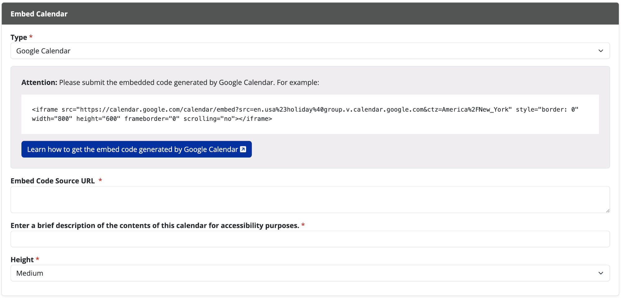
Embed Calendar
What is it?
The Embed Calendar chunk lets you easily show your Outlook or Google Calendar events on a webpage, making it simple for people to see your schedule.
When should I use it?
Use the Embed Calendar chunk when you want to share your department's schedule or upcoming events on a webpage in a user-friendly and visually appealing manner.
How do I create one?
- Open up the content page you want to add a Embed Calendar chunk to.
- Click on the "calendar" icon (see the image to the right).
- Drag the chunk to its desired location on the page, and resize if needed.
- Add a heading (optional) to the calendar chunk.
- Add the embedded code from the calendar you want to feature.
- Add a brief description about the calendar.
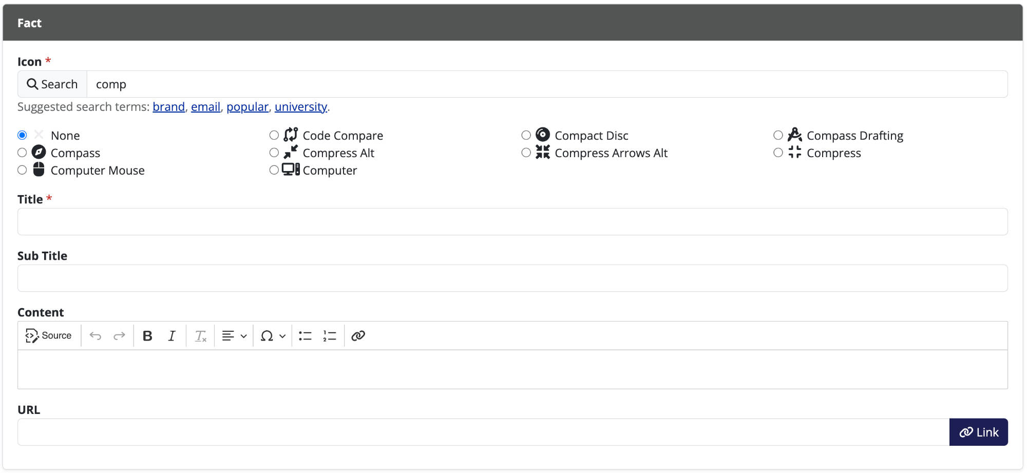
Fact
What is it?
Allows admins to highlight a specific callout using an icon, title, and description.
When should I use it?
Use the fact icon to highlight numbers, statistics, and short textual callouts.
How do I create one?
- Open up the content page you want to add a fact chunk to.
- Click on the "i" icon (see the image to the right).
- Drag the chunk to its desired location on the page, and resize if needed.
- Search for and select the icon you want assigned to your fact.
- Choose the icon's color from the list of available colors.
- Add additional optional text to your fact by filling in the title, sub title, & content sections.
- Choose how you want the content to be displayed.
- Visible under your title and sub-title.
- Hidden until a user places their mouse over the fact icon, which then reveals the content you've added.
- Add a link to the fact by placing a URL in the box.
Heading
What is it?
A heading on a webpage is like a signpost that tells you what each section is about, making it easier to find and understand different parts of the content.
When should I use it?
Use headings on a webpage whenever you want to organize information into distinct sections, making it clearer for visitors to navigate and comprehend your content. People with vision impairments using screen readers often use headers to navigate your site. Headers should be used to structure your content. Do not use headers to make text visually different that would normally utilize a paragraph chunk.
How do I create one?
- Open up the content page you want to add a heading too.
- Click on the "H" icon (see the image to the right).
- Drag the chunk to its desired location on the page, and resize if needed.
- Provide your main heading, and sub heading (if applicable). You may change the size, font style, and font family of both headings.
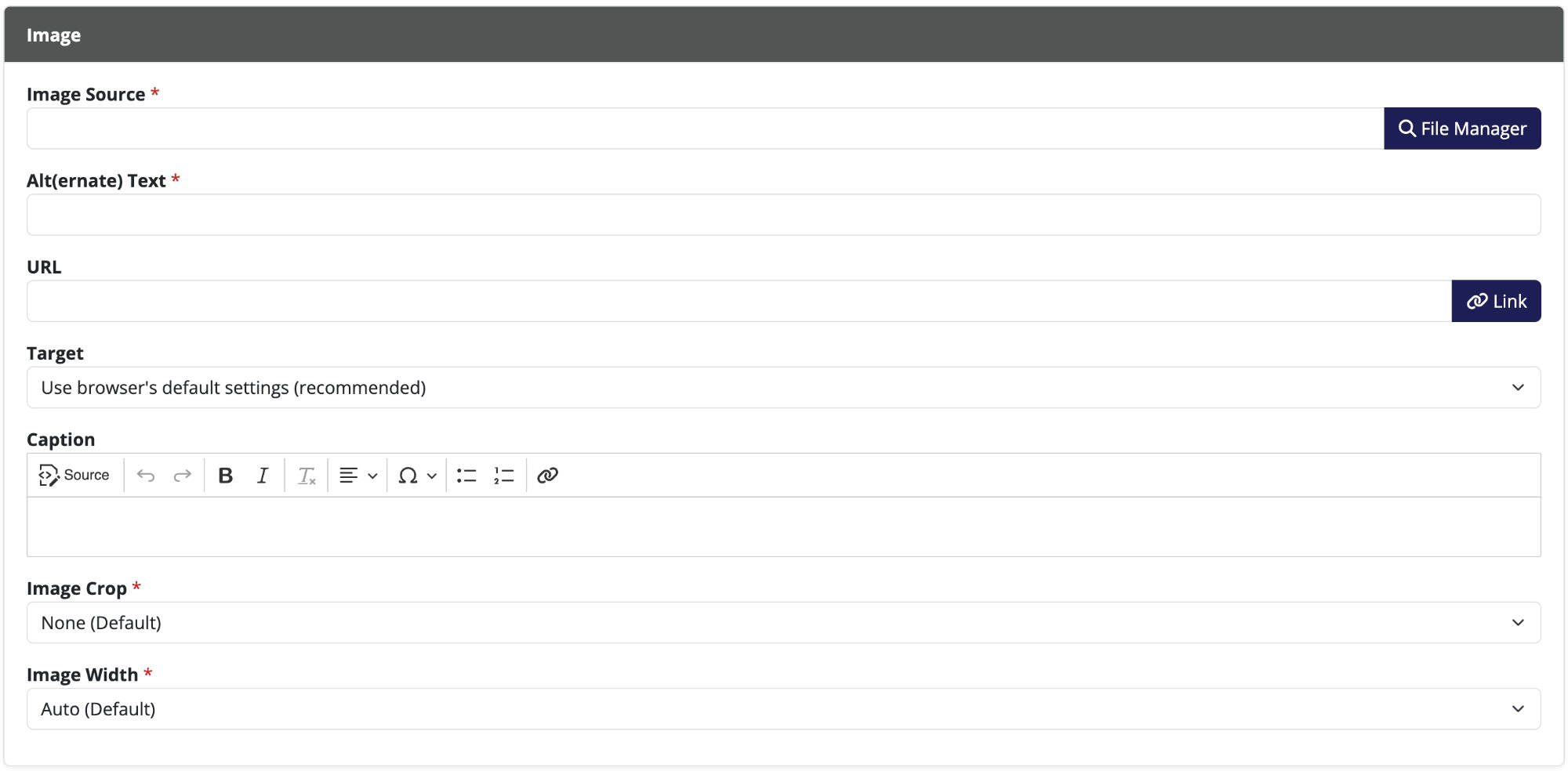
Image
What is it?
An image chunk is a visual element, such as a photo or illustration.
When should I use it?
Use an image chunk to visually enhance your content, making it more appealing and helping to convey information in a way that words alone might not achieve.
How do I create one?
- Open up the content page you want to add a image to.
- Click on the "picture" icon (see the image to the right).
- Drag the chunk to its desired location on the page, and resize if needed.
- To add your image select File Manager
- If the image has already been uploaded, find and select the image under File Manager
- If the image has not been uploaded, click the Upload or Widen tab at the top
- Select Choose File to upload your image
- Add tags before uploading (optional)
- Click on Submit
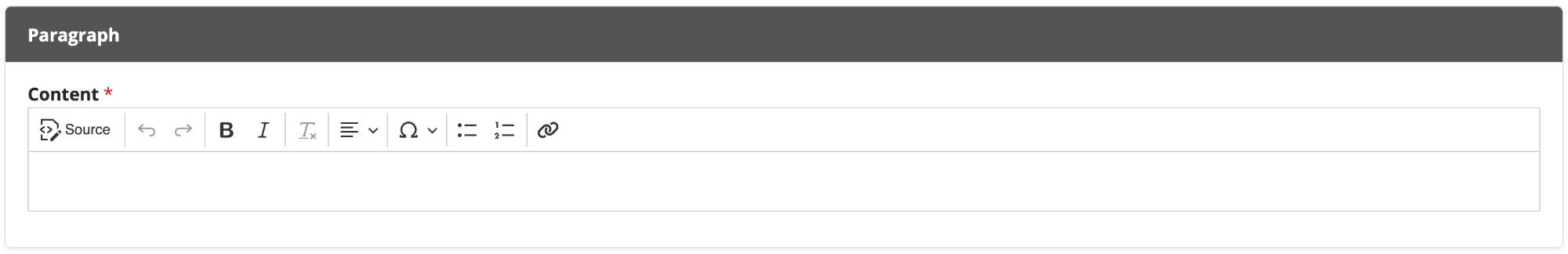
Paragraph
What is it?
A paragraph chunk is a block of text that's grouped together, helping to organize and present information in a readable way.
When should I use it?
Use a paragraph chunk to present a single idea or piece of information in a cohesive manner, making your content more structured and easy for readers to follow (a paragraph chunk can contain multiple paragraphs).
How do I create one?
- Open up the content page you want to add a paragraph to.
- Click on the "P" icon (see the image to the right)
- Drag the chunk to its desired location on the page, and resize if needed.
- Add the text you want to display in the content box. Use the editing tools to format your text (bold, italicize, bullets, links, etc.).
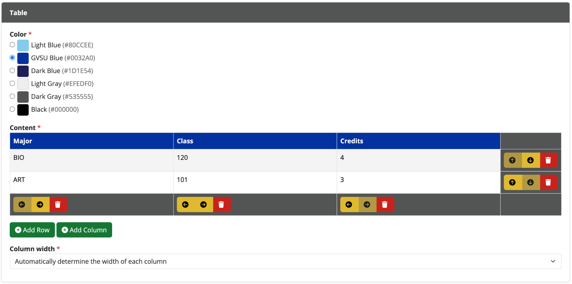
Table
What is it?
A chunk that allows a user to place a table of data on a webpage.
When should I use it?
Use the table chunk to show data in a structured format. Tables should not be used to layout a design, but should be used to present data in a grid, similar to data found in a spreadsheet.
How do I create one?
- Open up the content page you want to add a table chunk to.
- Click on the "table" icon (see the image to the right).
- Drag the chunk to its desired location on the page, and resize if needed.
- Move a row (up/down) or column (left/right) by clicking on the blue directional arrows.
- Delete a row or column by clicking on the red trash can button.
- Edit the text in each row and column by clicking on the generated text box.
- Add additional rows or columns by clicking the green +Add Row or +Add Column buttons.
- Choose whether the columns width will be evenly distributed or automatically distributed based on the amount of text in a cell.
- Change the color of the top row of the table by selecting from the available options.
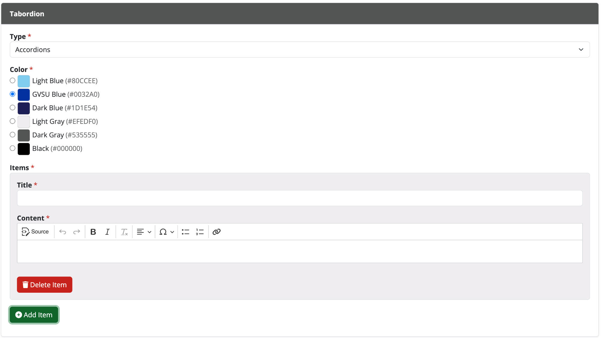
Tabordion
What is it?
A tabordion is a chunk that allows content to be collapsed or expanded in either a series of tabs or a collapsable accordion menu.
When should I use it?
Use this chunk when you want to hide information that not all users will need to see. In most cases you should use a paragraph chunk and not a tabordion chunk.
How do I create one?
- Open up the content page you want to add a tabordion to.
- Click on the "tabordion" icon (see the image to the right).
- Drag the chunk to its desired location on the page, and resize if needed.
- Edit the chunk and add as many tabs/accordions as needed.
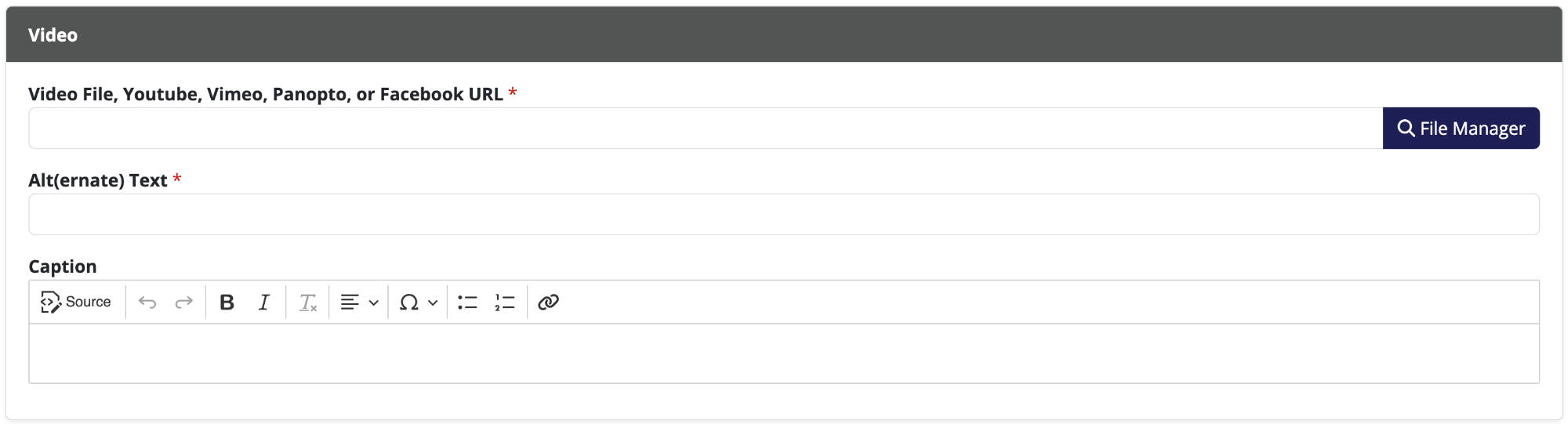
Video
What is it?
A video chunk allows you to embed a video with controls on your website.
When should I use it?
Use the video chunk to show visitors a relevant video to your content.
How do I create one?
- Open up the content page you want to add a video to.
- Click on the "video" icon (see the image to the right).
- Drag the chunk to its desired location on the page, and resize if needed.
- Add Alt(ernative) Text describing the content of your video.
- Add the link to your video from one of the compatible video hosting websites. You can also upload a file with a .mp4 extension to your File Manager.
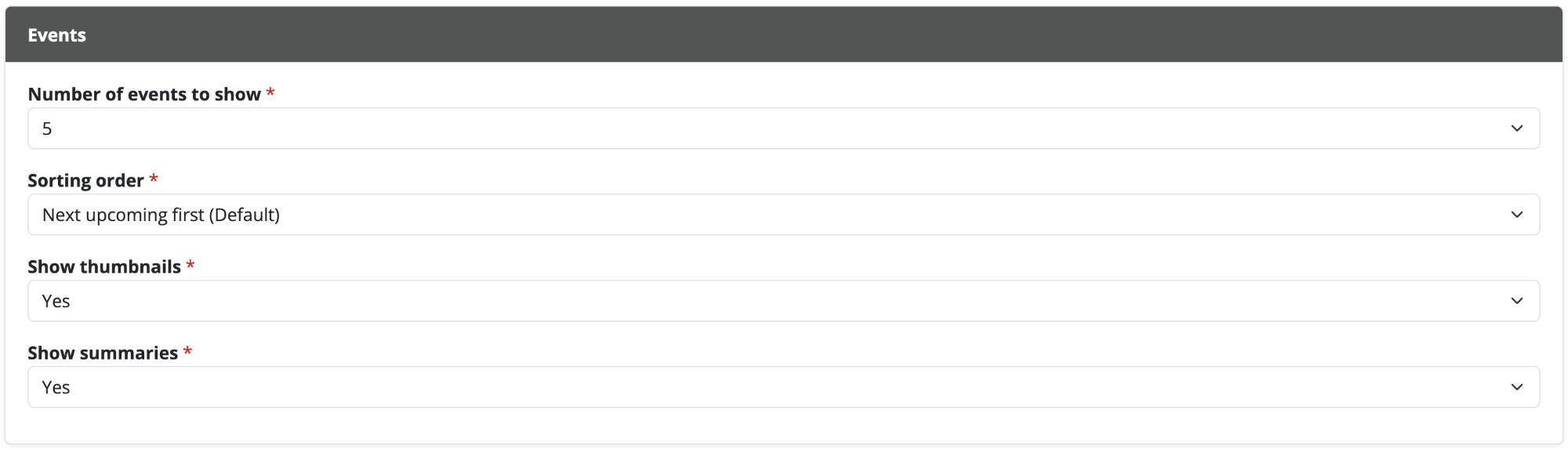
Events
What is it?
This chunk shows either a list or a calendar view of events you have added to an events module.
When should I use it?
Use this chunk when you wish to show a list of upcoming events to your website's visitors.
How do I create one?
- Click + New Module and select events.
- Give your event module a name if desired.
- Click + New Event.
- Edit or adjust all applicable fields.
- Click Submit when done.
Adding the module to a content page:
- Click edit on the page you want to add the module to.
- Click modules from the toolbar on the right.
- Select the event module you created in the steps above.
- Drag the event module to its desired location on the page, and resize if needed.
- Click edit on the chunk to adjust settings.
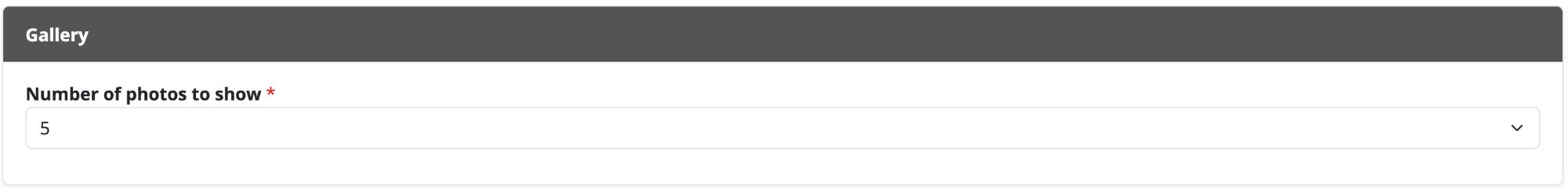
Gallery
What is it?
A module that allows you to share photos on your website.
When should I use it?
You should use the photo gallery when you want to show case photos from a portfolio, event, etc.
How do I create one?
- Click + New Module and select photo gallery.
- Give your module a name if desired.
- Click + Add Photos.
- Choose or upload any number of photos.
- Edit or adjust all applicable fields.
- Click Submit when done.
- You may reorder the photos in your gallery.
Adding the module to a content page:
- Click edit on the page you want to add the module to.
- Click modules from the toolbar on the right.
- Select the photo gallery module you created in the steps above.
- Drag the photo gallery module to its desired location on the page, and resize if needed.
- Click edit on the chunk to adjust settings.
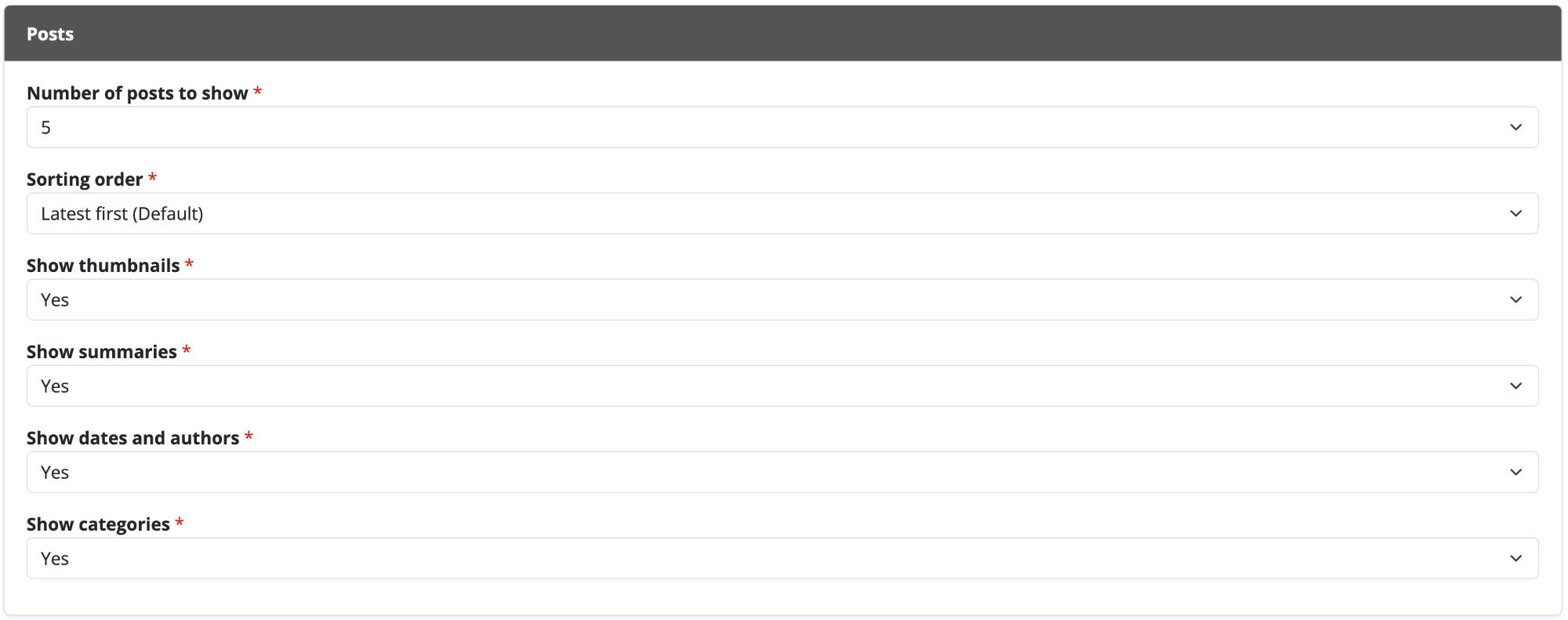
Posts
What is it?
A module that allows you to share news, spotlights, or blog posts on your website.
When should I use it?
You should use the posts module when you want to periodically add dated entries.
How do I create one?
- Click + New Module and select posts.
- Give your module a specific name if desired (eg: "Blog", "News", or "Spotlights").
- Click + New Post.
- Edit or adjust all applicable fields.
- Click Submit when finished.
Adding the module to a content page:
- Click edit on the page you want to add the module to.
- Click modules from the toolbar on the right.
- Select the posts module you created in the steps above.
- Drag the posts module to its desired location on the page, and resize if needed.
- Click edit on the chunk to adjust settings.
Chunks
Not all of the above chunks are shown in the editor's toolbar by default. If you often use a specific chunk that is not available in your toolbar you can click the "star" icon next to the chunk to add it to your toolbar as a favorite.
Templates
To assist you in creating your website we have created many templates. Templates are a set of predesigned chunks you can use on your site. After adding a template you are able to make any changes to meet your needs. If you often use a specific template you can click the "star" icon next to the template to add it to your toolbar as a favorite.