START Project: Celebrating 20 Years
In 2021, the START Project celebrated 20 years of working with schools, community partners, and families to support students with Autism Spectrum Disorder (ASD). As we think about the last 20 years of working on behalf of students with ASD, we are immensely proud of all we have accomplished. We want to take this opportunity to honor the work over the last 20 years, and also to look ahead at what's next. Please join us in this celebration.
Looking Back at the Last 20 Years
Join us in looking back at the last 20 years and looking ahead to the next 20 years! We are sharing a brief snapshot of our project's data and a look into our milestones over the last 20 years. Finally, we offer you a glimpse of where our community was, where it is now, and where it is going.
Where we are going
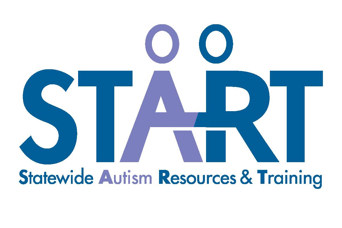
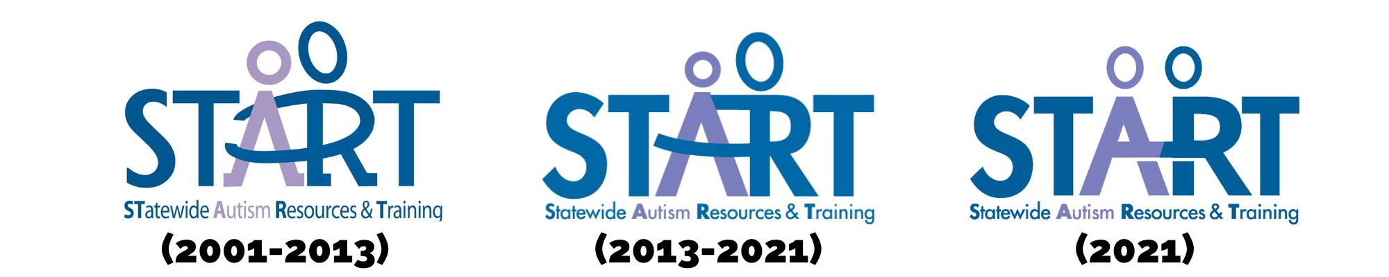
Introducing the Refreshed START Logo
January 25, 2021
Today is an exciting day for the START Project, as we launch our refreshed logo to kick off the celebration of our 20 year anniversary.
Why refresh our logo?
As we think about the last 20 years of working on behalf of students with Autism Spectrum Disorder (ASD), we are immensely proud of all we have accomplished. Our project has grown and evolved over the years. START looks much different than it did 20, 10 or even 5, years ago, and our logo reflects those changes evolving with our project. As we look forward, we felt it was time for a refresh.
Collaboration and partnerships are core values of START, and it is critical to us that our logo represent those values. The work of the START Project is only possible through the dedication and commitment of an entire community of educators, families, and partners working together, collaboratively, to support students.
Key focus of our refresh:
Since our project is rooted in collaboration and partnerships, we wanted our logo to reflect those values. Our previous logo could be seen as conveying one person (an adult) is leading or guiding the other (a child). With our refreshed logo, the linking of an “A” and “R” of equal stature, represents our entire community working together as a team to support students with ASD in Michigan. We are standing side by side in our commitment to students.
We also wanted our refreshed logo to reflect a more modern look, while still retaining our project identity. The linking of “A” and “R” conveys a connected and modern image. The colors maintain our identity as a project and reflect our logo’s core elements.
What’s next?
Keep an eye out for more updates as we celebrate our 20 year anniversary. While our celebration will look different in a virtual format, we remain excited by this opportunity to share new information and refresh our work moving forward. We will be updating our materials and resources with our new look in the coming months. We invite our partners and trainers to update their materials and resources as well. We have launched a new page on our website outlining our standards, formatting, and logo guidelines.