Geology faculty member creates map of U.S. that traces COVID-19 spread


The multitude of numbers related to COVID-19 — cases, deaths, recoveries, hot spots — can be overwhelming, even for a researcher.
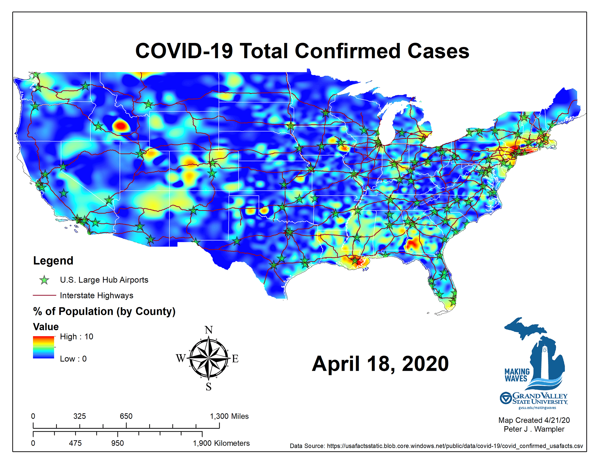
Peter Wampler, professor of geology and Meijer Honors College faculty-in-residence, said COVID-19 graphs and images from national organizations were difficult to analyze quickly. So, Wampler created his own graphics to tell the story of how coronavirus spread throughout the contiguous United States.
He used county data from USAFacts.org and ArcMap software to visually show how the virus spread from March 7-April 18 on a map that indicates major airports and interstate highways. View the YouTube video here.
Once his data was set, Wampler said it showed some surprises.
"There were initial outbreaks in northern Washington state, and cases in Idaho and the Rockies seemed to pop up out of nowhere," he said.
Students in Wampler's GIS classes used similar mapping methods last semester to show the number of contaminated water sites in the state due to PFAS in the groundwater.
Wampler, who is a co-chair of the Making Waves Initiative, said he plans update these maps weekly and use COVID-19 data in his fall semester classes.
Subscribe
Sign up and receive the latest Grand Valley headlines delivered to your email inbox each morning.