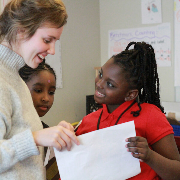
An example of a data visualization from the New York Times.
Image credit - Image from New York Times, nyt.com


In a global pandemic, it can be hard for scientists, policymakers and governments to effectively communicate accurate information about complex topics to the general public, but the growing field of data science and analytics is helping to make information easier to understand.
"Right now, big data and analytics contains incredibly powerful tools to help us in the face of a pandemic," said Ed Aboufadel, associate vice president for Academic Affairs and leader of Grand Valley’s Big Data initiative. "We have the immense speed and power of computers today, as well as new and novel ways to collect data. With the coronavirus, people are developing clever approaches of taking data to better understand the pandemic and help more people survive."
Aboufadel said that in March, he started getting emails from faculty members sharing good examples of data visualizations being used to explain and show important information related to COVID-19. To keep those examples in one space and make them available to the GVSU community and the public, he started a website that serves as a repository of good visualizations and articles that use data to explain information.
"Colleagues from many different disciplines started sending links about COVID-19, and I really began to see what was going on, how big data was being used," Aboufadel said. "The analysis of big data so far in this crisis has helped scientists understand the speed and geography with which the virus spreads and how to work on mitigation so we all aren’t stuck at home for the next six months."
A good example, he said, is the nearly real-time data site being run by Johns Hopkins University, and some examples that are also coming from the media.
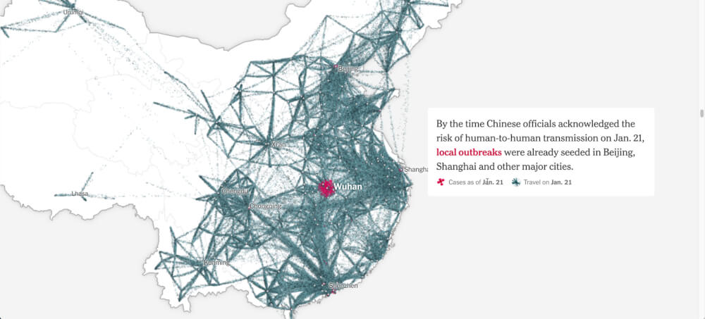
"There's a particularly good animated visualization that used cell phone location data for people in Wuhan, China, and mapped how they traveled to other parts of the world, and it was done like a subway map," Aboufadel said. "Then we have visualizations about curves — the basis for the phrase 'flatten the curve' — that show case numbers relative to the capacity for care in the health care system. I believe some of these visualizations have been important in the decision making of some lawmakers."
Aboufadel said combining big data with good visualizations helps tell the right story and make the right decisions, but stressed that visualization tools have to be used with accurate data, or information can be misrepresented.
Sign up and receive the latest Grand Valley headlines delivered to your email inbox each morning.